

I love to write. In my third grade composition book (which I still have), there are countless ghost stories written a la Stephen King. In high school, I took a journalism class and got published on the front page of our school newspaper (big deal, right?). I was an English major in undergrad, having to read a slew of Shakespeare in order to craft meaningful and contemporary analyses of his work. I even love different forms of “writing”. In grad school, my entire thesis paper was about how I use photography to construct visual narratives.
On top of that, I’ve spent the past 12 years of my professional career being employed in roles where written communication was my primary responsibility: 10 years in marketing and now project management.
With that being said, I find writing to be really, really difficult. Well, because it is! It’s time intensive. It requires organization, consideration, and discipline. . .a lot of it.
I’m not alone. As a project manager, I work with many clients who have an incredible product or service but have struggled to convey in written form all that is wonderful about what they do. Part of my role is to help them get their message across on their websites in the most effective way possible.
What I’ve realized works with website design is to take at all the components of a web page—text, pictures, graphics, typography, structure—and make them work as a team to help deliver your online message. Below, I share a few recommendations on how to do that with the hopes that you’ll find writing to be less of a painful chore and more of a fun, creative activity that ultimately delivers you results online.
Before you begin typing on a keyboard, ask yourself, “Who is my audience?” The word choice, tone, and style of an email you write to your boss is vastly different than the one you’d write to your best friend.
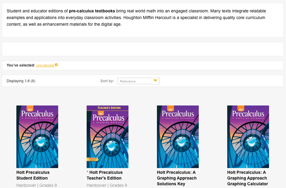
Perhaps your customer base is comprised of teachers seeking educational materials for the classroom. Then your writing style might lean more toward instructional and professional then irreverent and funny. Not saying teachers don’t have a sense of humor or appreciate references to pop culture. But there is a time and place for that style of writing, and your customer base isn’t expecting slang, incomplete sentences, or animated GIFs, when looking for pre-calculus workbooks.
Below is taken from Houghton Mifflin Harcourt. The language used is short, succinct, and professional.
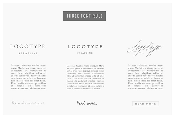
We now live in a day and age where the options to jazz up your page with beautiful typography that is actually text and not text saved as graphics are unlimited.
Use large headings to call attention to different areas of your page or to break up large amounts of copy. Pair a Serif font with a Sans Serif font and perhaps throw in a script font (why not?) for your Call to Action.
It looks great and according to Behance, it’s on trend right now for 2016.

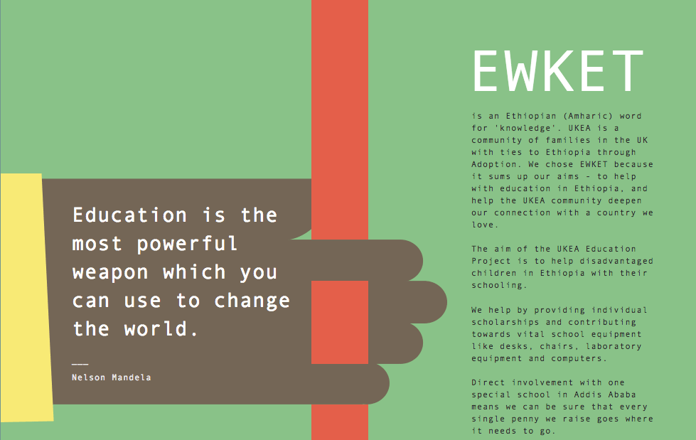
The example below is taken from Ewket and it’s another lovely representation of leveraging great typography to make a fair amount of copy enticing to read.
Okay, Marketing 101.
Features address the facts about the product or service being provided.
Features based writing ex: We design and develop websites using WordPress.
Benefits address the value a product or service provides. It’s ultimately what sells your product, service, brand, etc., because they define, “Why should I care?”
Benefits based writing ex: We design websites that are modular, scalable, load lightning fast, and feature user-friendly admin, enabling our clients to easily add, edit, and remove content on the fly.
Maintain a good balance between the two of these on your website. Features are still necessary for Search Engine Optimization and for describing your product from a technical standpoint. Just know that not everyone will interpret your Features list in the same way. Use benefits to help paint the picture for how your company is going to change their lives.
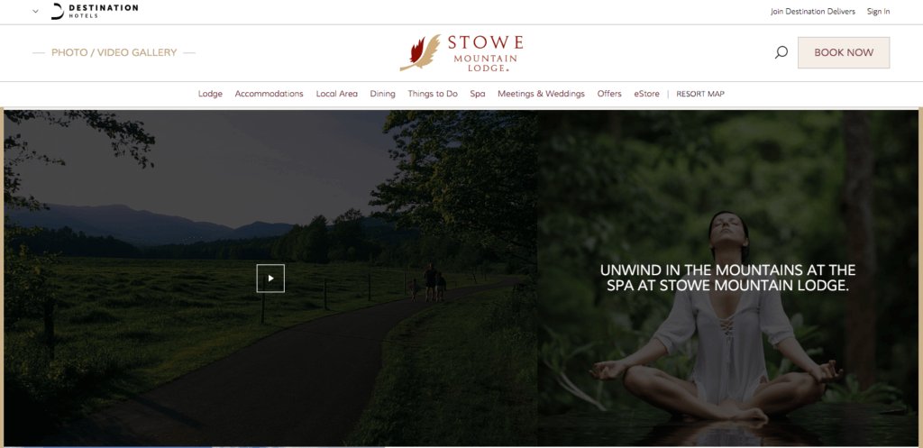
Yes, we’ve all heard the cliché: “A picture is worth a thousand words.” But seriously. I’m saying it again. Pictures, whether still or moving, make all the difference in communicating an idea. Hire a photographer, buy stock images, shoot a video—whatever it takes, but get great imagery onto your website. Now.
This example is taken from Stowe Mountain Lodge, right here in Vermont. On the left is a video of a beautiful stroll through the Vermont countryside. Next to that is a woman looking exceptionally relaxed with copy on top that says “Unwind in the Mountains.” I want to be her. I want to go there. Right. Now.
Search Engine Optimization is a whole topic in and of itself. I can barely scratch the surface with what I’m about to mention here. However, what I will say is make sure SEO is guiding your content decisions. A few quick tips:
Have questions, comments? Agree, disagree? Share them with me below. For help with your next website design or development project, be sure to contact Burlington Bytes online or by phone at 802-448-4001.
Thanks for reading!