CASE STUDY
Credit Union Boosts Mobile Conversion Rate +154% YoY
Learn how we optimized the People’s Credit Union website to increase account openings and member applications for this Rhode Island-based community financial institution.

Main Objectives
A few years after working with our team on a website redesign, People’s Credit Union signed on for our conversion rate optimization (CRO) services with the objective of assessing their website’s effectiveness in meeting the needs of current and prospective members. Recognizing the limitations of making website changes based on internal assumptions, People’s Credit Union wanted to instead enhance their website by gathering both qualitative and quantitative data to evaluate user satisfaction and experience, specifically through a combination of A/B testing and user behavior analysis.
The ultimate goal of this analysis was to encourage more users to take revenue-driving actions on the site, especially through account openings, member sign-ups, and customer service contacts.
- Gather User Data to Obtain Insights Into Site Changes
- Identify & Remove User Experience (UX) Barriers Across the Site
- Increase Account Openings & Grow Member Acquisition
Overarching Challenges
People’s Credit Union struggled to maximize conversion rates due to limited visibility into how users were actually engaging with their digital channels. As a result, conversion friction and UX barriers went undetected and unresolved, resulting in lost opportunities for account openings and member acquisition.
Lack of User Data for Decision-Making
Historically, website optimizations had been made based on internal assumptions rather than actual user behavior, thus limiting the ability of these changes to effectively serve users’ financial needs online. Without this crucial data, website changes would never be 100% effective at identifying or solving user problems.
Friction Causing Lost Opportunities
Users faced numerous unnecessary obstacles in multiple conversion paths, making it more challenging for users to complete revenue-driving actions. Although seemingly small, obstacles like the extra steps in the application process and the confusing calls-to-action in the path to becoming a member were diluting conversion rates.
Critical UX Barriers on Mobile Devices
Hidden across the website were mobile barriers blocking users’ access to essential banking services and product information, such as the alerts pop-up in the main menu. Not only was this barrier reducing engagement and traffic to key service pages, but it was also a key source of “rage clicks” and user frustration.

Strategy & Solutions
To address these challenges, our team conducted a comprehensive website audit using our full suite of CRO tools: screen recordings, heatmaps, and A/B testing. From this data, our team generated a comprehensive list of optimizations and recommendations on how to improve user experience and increase conversions across the People’s Credit Union website.


A/B Testing Buttons on Personal Checking Pages
One of the first A/B testing experiments we ran for the People’s Credit Union team was on the call-to-action buttons on their personal checking pages. This test compared one button opening a modal window (the original variant) against two buttons with no modal. The ultimate goal was to see if removing the additional click within the modal would result in a higher conversion rate for those looking to open their account, as well as a higher conversion rate for those looking to become a member.
This test ran over the course of a 40 day time period, and the final test results indicated that having two buttons instead of one led to a higher conversion rate for the Open Account goal. Although the Become a Member goal was not as statistically significant, the two button variant still had a 96% probability of being the best. As such, our recommendation was to implement the test variant as a permanent design change.

A/B Testing Removal of Duplicate CTAs on a Personal Savings Page
Another A/B test we ran on the People’s Credit Union website took place on one of their personal savings pages. This test focused on removing one of the two “Here to Help” CTAs on a personal savings page, the hypothesis being that the test variant with less redundant CTAs would ultimately drive more conversions.
This test ran over the course of 23 days, with the test variant driving double the conversions and a higher conversion rate than the original with duplicate CTAs. The test variant also had a 94% probability to be the best, further confirming our recommendation to make this change on all pages for consistency.
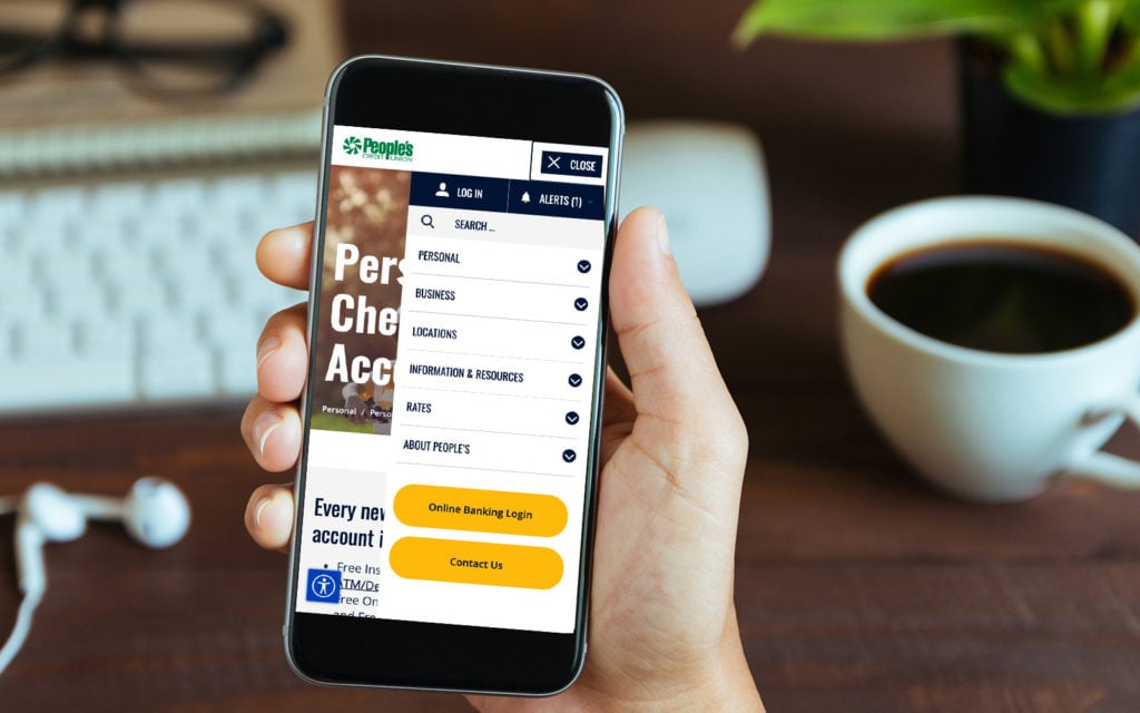
User Behavior Analysis on Alerts Pop-Up in Mobile Menu
One of the biggest discoveries of our user behavior analysis efforts was a user experience (UX) barrier in the mobile menu. Initially uncovered through screen recordings, this issue occurred as mobile site visitors attempted to open the main menu and were immediately hit with an Alerts pop-up. Users were not only attempting to close the pop-up without reading it first, but were also physically unable to do so as the “X” button was too small. As a result, a surplus of rage clicks were being recorded.
This UX issue was further reinforced and elaborated upon by heat map analysis. Since users could not exit out of the pop-up, they were then unable to access the important service links hidden underneath. We immediately implemented this change, updating the default Alerts pop-up status from open to closed for mobile device users.
Since making this change, the previously blocked service pages in the mobile menu have received significant increases in both mobile sessions and engagement, including a 22% increase in total views, 13.2% increase in total users, and a 9.29% increase in conversion rate. Year over year data also shows a 157% increase in total views, a 121% increase in total users, and a 154% increase in conversion rate.
Hear From People’s Credit Union

Jessica Holden
As our website designer and programming partners, we have had a fantastic relationship with Bytes.co over the last several years. The team at Bytes.co excels at digital marketing, search engine optimization, and conversion rate optimization. You cannot go wrong with this team.
Need Help With CRO?
Tired of making website decisions based on hunches? Let’s uncover the hidden opportunities in your digital experience.
Our CRO experts use real user data, not guesswork, to eliminate friction, boost conversion rates, and drive measurable growth. Drop us a line – we’d love to show you what data-driven CRO can do for your business.