
As our team prepares to attend this year’s NEFMA conference, we’ve been reflecting on the conversations happening across regional banks and credit unions, particularly around brand, customer connection, and the evolving role of the digital experience.
What we’re seeing, both in these industry discussions and in our own client work, is a clear shift in strategy. It’s no longer just about improving the website as a standalone channel. Instead, financial institutions are beginning to recognize that the online experience they’re providing to their users and their brand are the same.
A financial institution’s website is not just a place for transactions or a supporting touchpoint. For many users, it is the brand, and it shapes first impressions, builds trust, and sets the tone for the entire relationship.
Our recent work with 802 Credit Union is a reflection of this shift in action.
802 Credit Union is a Vermont-based, member-owned financial institution offering a full range of personal and business banking services. With strong ties to the communities they serve, their focus has always been on accessibility, personal relationships, and long-term financial support.
When they partnered with us, the goal wasn’t simply to modernize their website: it was to create a digital experience that better reflects their identity while improving usability and driving meaningful action.
A primary goal of the 802 Credit Union website redesign was to align their digital experience with the strength of their brand and the quality of service they provide to their members.
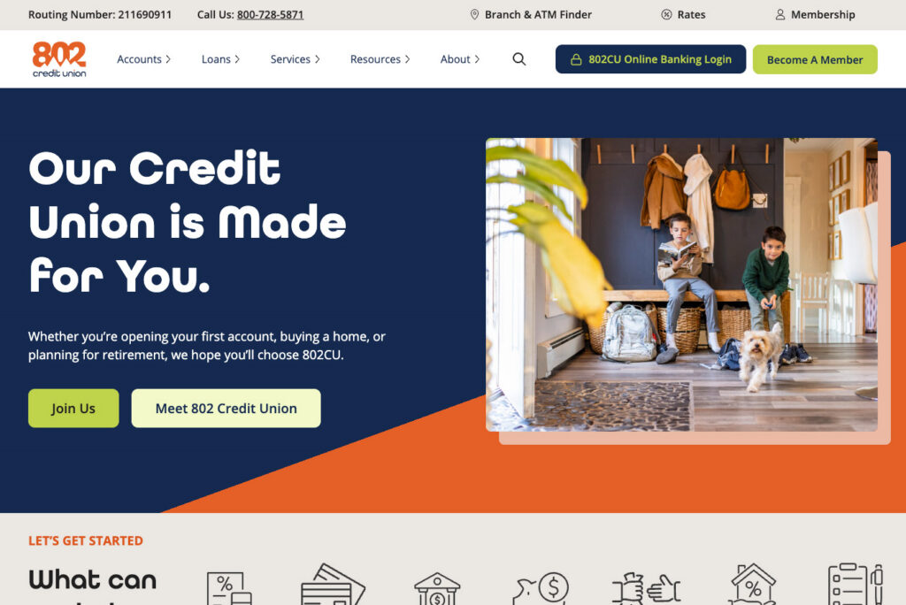
We wanted to create a website that more actively supported their users as they explored options, made decisions, and took meaningful next steps to become a member, open a new account, or visit a local branch.
This meant enhancing the experience to:
At its core, this was about evolving the website from a place where users went to find information to a place that helps them move forward with confidence.
This is because users approach banking websites with a mix of task-oriented goals and emotional considerations. They want to compare products, find rates, and locate branches, but they are also evaluating something deeper: Can I trust this institution with my money?
This insight shaped our approach, ensuring that every design and content decision worked not only to inform users but to build confidence and trust along the way.
Rather than thinking about the website as a collection of pages, we approached it as a system designed to support user decision-making.
Three core principles guided the experience:
The site needed to feel credible, transparent, and human from the first interaction.
This meant:
Users want help making decisions, and knowing that they also want to trust the site where they are making those decisions, we focused on:
Users prefer goal-based navigation and decision-support tools when evaluating financial products, helping reduce friction and uncertainty in the decision-making process.
Finally, every page of the site needs a clear purpose. With this in mind, we introduced:
The goal was to support users by making the right action feel obvious and accessible at the right moment.
One of the most important aspects of this project was visual direction.
In financial services, there’s often a tendency to default to traditional and “safe” design choices in the name of credibility and professionalism. While well-intentioned, this can lead to experiences that feel interchangeable and disconnected from the communities they serve.
Think about how many banking sites you’ve been on where you see the same stock photos, color schemes, and messaging that feel broad and genericized. If you’re reading this as a financial institution, does this describe your website?
Yes, these sites clearly look and feel like banking sites (which they should), but how can I tell them apart from one another? Why would I choose one bank over another?
With 802 Credit Union, we took a different approach, focusing on creating a visual experience that not only stands apart from other credit unions and banks but also helps users see themselves reflected in the brand.
802CU already had a vibrant palette for its brand colors. Rather than softening it or being selective with what we used, we decided to lean into all of their colors, creating contrast, hierarchy, and warmth throughout the experience.
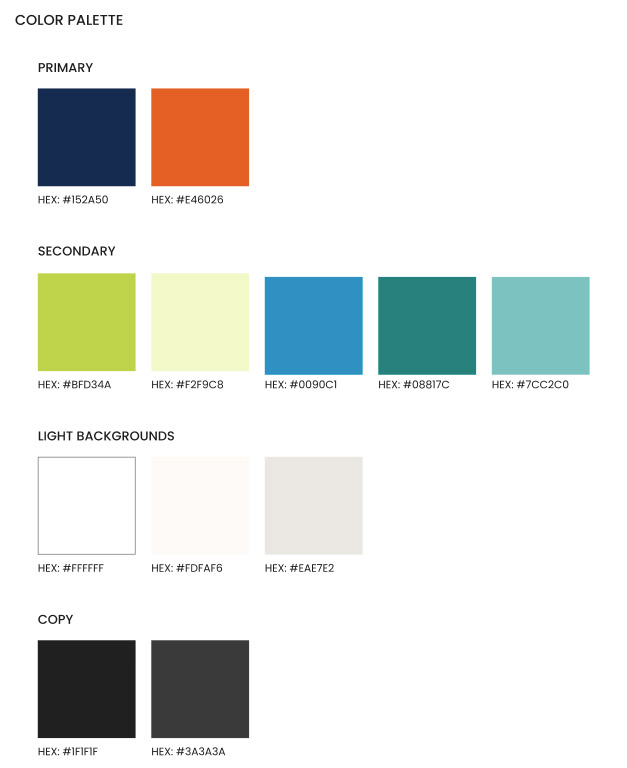
The goal was not just creating visual interest, but amplifying emotional tone. A site that feels welcoming, confident, and clear reinforces trust just as much as traditional “safe” design patterns.

In the example here, we built the hero sections so that the colors could be adjusted to align with the imagery and the product being presented. In the case of the First-Time Home Buyers Loan page, we are using the teals from the brand color palette. These colors feel reminiscent of those you’d likely use to paint the living room of your first home. The colors themselves are also grounding and calming. They convey trust with a nod toward smooth transition (think of gently moving water). The photography was selected to match the colors on the page so everything ties together, creating a visual experience that is intentional and authentic.
This is where photography becomes critical.
While color helped establish the tone and energy of the brand, photography brought it to life in a more tangible and human way. It gave users something to connect with, turning the brand from a visual system into a lived experience.
For this project, we partnered with JAM Creative, a Vermont-based photography team.
Their work captures everyday life in Vermont with a level of authenticity that stock photography often can’t replicate: people in real environments, engaged in real moments, having real emotions.
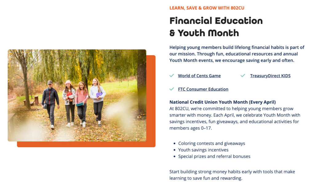
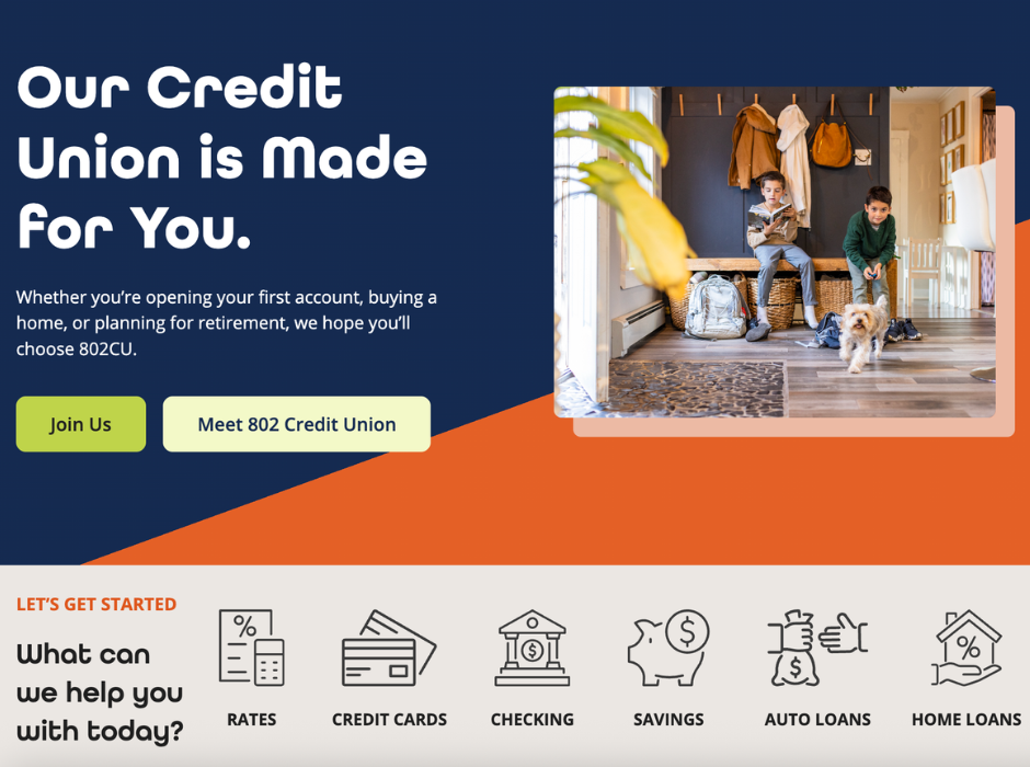
One of my favorite photos from JAM Creative (and there are many!) is this one we used for Youth Accounts. When I first looked at the photo, I thought it was of my daughter and her friends. I could relate to the photo immediately. On a banking website that is able to take my world and reflect it so beautifully and thoughtfully back at me? That is a brand that gets me. That is a brand I can trust.
We can’t say enough about the quality and intention behind JAM Creative’s work. I love all the thoughtful details that are included in the frame and how natural the scene feels, despite knowing these images had some sort of staging.



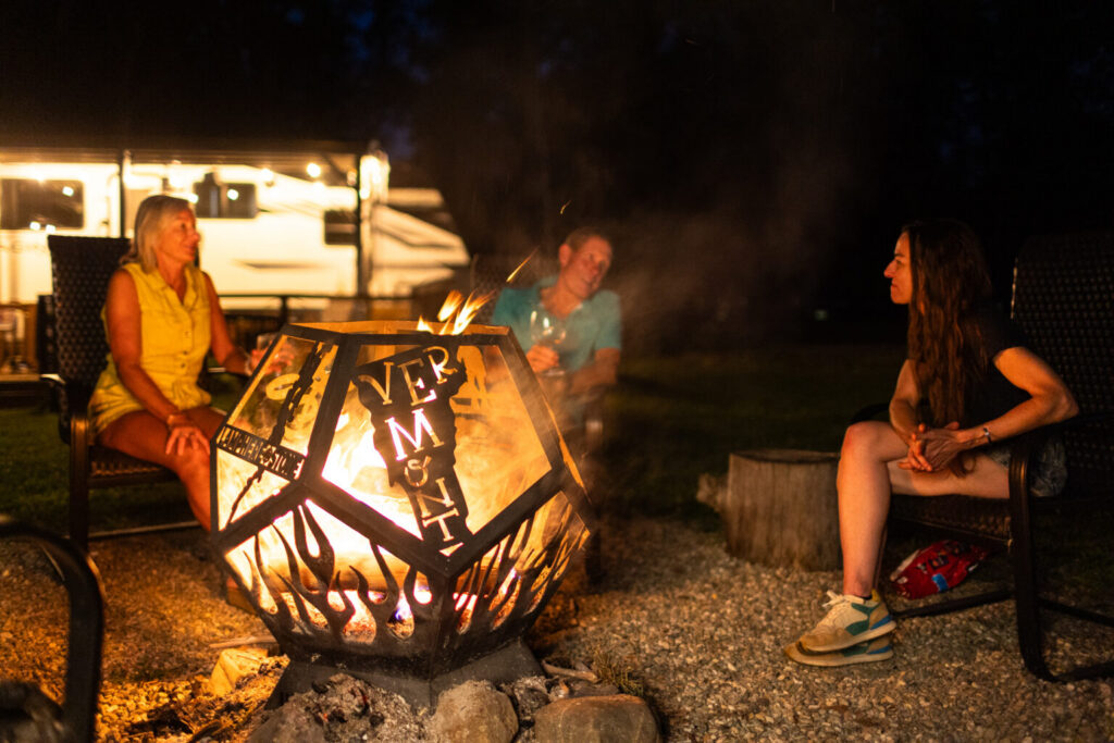
These photos added a layer of depth to the site that typically can’t be done with traditional stock photography. This is because:
We recognize that custom photography isn’t always feasible. One approach we explored was sourcing licensed imagery from local photographers, which can provide a middle ground that still delivers unique, regionally relevant visuals without requiring a full custom shoot. Some stock photo sites have a “local” filter where you can view images from a local photographer. Using imagery that provides a sense of place and a sense of personality is so critical to the digital experience and to how users perceive a brand.
What made this approach successful wasn’t just the quality of the photography; it was the intention behind it. Every image was selected and created to serve a purpose within the broader experience, reinforcing both the brand and the user journey.
To support the photography process, we provided JAM Creative with a clear creative framework.
Using demographic insights and AI-assisted concepts, we developed visual scenarios that reflected the types of imagery that best resonate with the audience 802CU serves. This gave the photography team direction, while still allowing space for interpretation and authenticity.
The result is imagery that a user can connect with in a relatable and authentic way.
The design decisions we made in creating the new 802CU website were about more than aesthetics; they were about creating a meaningful connection between the brand and its audience.
Design and strategy set the foundation, but at the end of the day, it’s performance that tells the story. In the months following launch, we’ve seen strong indicators that the new experience is not only engaging users but guiding them toward meaningful action.
Comparing the three months after launch to the three months prior, overall conversion rate increased by 19.46%, with total conversions rising 25.31%, even as overall traffic saw a more modest increase of 6.59%.
This tells us that the site isn’t just attracting more users. The new design is helping more of them take action.
Organic performance also showed notable gains. Organic sessions increased by 10.12%, while organic conversions rose 16.17%, resulting in an 8.66% lift in organic conversion rate. Engagement improved as well, with higher session duration and more views per session, alongside a meaningful decrease in bounce rate.
Direct traffic told a similar story of improved intent and action. While sessions increased slightly, conversions rose significantly, up 35.52%, with a 24.14% increase in conversion rate.
Looking at these early results, we can point to a more effective digital experience. The new 802CU site creates a seamless brand experience that not only supports user needs but also actively guides them toward the next step with confidence.
Today’s banking customers expect a digital experience where they feel understood. These users are doing more than evaluating rates or products; they’re evaluating whether a financial institution aligns with their needs, their values, and their everyday lives. Designing for connection means creating experiences that feel clear, personal, and grounded in reality. If a user can see themselves reflected in the brand, they will feel confident taking the next step.
Authenticity, transparency, and relatability are key drivers of trust and engagement, particularly in industries where the stakes are high and decisions carry long-term impact.
For regional banks and credit unions, your connection to your community is your greatest differentiator. Your digital experience should reflect that—not just through messaging, but through design, imagery, and structure.
As conversations at NEFMA continue to explore brand, growth, and evolving customer behavior, one theme stands out:
Digital experiences are no longer separate from brand—they are the brand.
For 802 Credit Union, that meant building a website that invites users in, guides them forward, and reflects the community it serves.
For the broader industry, it raises an important question: What would your website look like if it truly reflected who you are?