
Almost every new project conversation we have now includes a question about AI. We hear our clients ask: Can AI make my website cheaper? If it makes your team faster, do I get more for the same budget? Will my site end up looking like everyone else’s? I built this design using AI; can you launch it?
There’s usually one more question that sits below the surface of the others, and it tells me the most about what a client is actually considering. If AI can do so much of what an agency does, why hire one?
Using AI is no longer much of a distinction or a selling point. A 2026 report from Designer Fund and Foundation Capital found that 91% of designers use AI for design work at least weekly, up from 54% a year earlier. As a designer myself, AI is highly integrated in my workflow.
So “do you use it?” is an easy question to answer by pointing to the efficiencies, the time saved, and the extra deliverables our clients now get. Those are all real benefits of leaning into and leveraging AI. But “why hire you?” deserves more than a bulleted list of our AI-enhanced outputs.
AI is very good at producing material: data, drafts, options, and recommendations. Deciding which of it belongs on a client’s website, and catching what’s not quite right or accurate about it, is the job. Get that correct, and the result is a site built on how its visitors actually behave, with a clear, data-backed reason behind every major decision. Get it wrong, and the client has a polished site that looks great and works fine, just not for the people who actually use it, and not in a way that makes them stand out among a crowded landscape of AI-produced materials and content.
We recently started a redesign discussion with an online boutique retailer that has a 42,000-product catalog. A site that size has a long list of features and functionality it could build, and a much shorter list of what should come first within their budget. Sorting through project requirements used to take several discovery sessions, a stack of reports to review from different tools (all generated by different members of our team, mind you), and hours of scope development.
This year, we developed a connector to our client’s Google Analytics where we can ask questions about the site’s users, performance, and more. I don’t have to feel lost and overwhelmed when accessing Analytics, knowing what questions I want to ask but not sure which report contains the answers. With our new tools, we can easily ask the data anything we want and have the answers before we sit down with our clients.
Sure, we could spend the time to pull reports to help us answer each of these questions, but being able to tie it to a real-time assessment of the page or section of the site in question gives us way more context than just a simple report. And then saying, “go ahead and fix this so that we can improve the experience that the data is flagging,” and let’s show our clients alongside the data…it just changes the whole conversation. We can show them the challenge and the opportunity all at once.
Having that data up front makes it so much easier to prioritize and deprioritize functionality with clients. In the case of our e-commerce client, it took one meeting to whittle down the list before we had even put together an official scope of work. Front-loading discovery and sharing it with the client for their reaction lets us write a tighter, more accurate list of requirements. That means fewer surprises once the build starts. Here’s some of what the data showed and what we decided because of it.
| What the data showed | What we decided |
|---|---|
| Top site searches are exact part numbers, and searchers grew from 34K to 49K | An open search field in the main navigation, part numbers on product cards, and an exact part number search that goes straight to the product page instead of a results page |
| About 11,000 users filtered by one specific criterion, spending 3 to 4 minutes each | That criterion comes first in the Products menu and the filters |
| The homepage is the biggest entry point to the site | Hero height capped so the shop-by row sits above the fold |
| Order history was viewed 11,285 times | New Arrivals and Pre-Order get top billing, plus a pre-order list with ship dates in each customer’s account |
| The compare tool was used by 138 people in a year | Compare removed |
| Desktop is about 56% of traffic and mobile about 41%, with mobile orders up 18% | Desktop and mobile designed with equal care, instead of mobile-first |
| Traffic peaks from November through March | Launch planned for late spring or early summer |
The data also surfaced a risk early that may have been hard to catch previously. Products carried 22 different availability statuses that mixed stock levels, lead times, and other caveats. Cleaning that up went on the risk list before design started, instead of turning into a surprise during the build.
A few of those decisions go against habit for an ecommerce site. Plenty of online stores keep a compare tool because competitors have one. Mobile-first is close to a reflex in our industry, especially in ecommerce. And most clients want to launch the moment the site is ready. The numbers made the case each time, and we could plan the project better before it officially started.
We could do this before AI, and on large, complex projects we did. It just took more time, so we usually saved that level of discovery until after a scope was signed. And, once we have the scope, it’s harder to pivot. From a client’s perspective, they don’t want to hear they need to invest more budget after a proposal is signed because we uncovered something in discovery. I’m not saying this will never happen again because surprises do come up. We’re just seeing fewer of them, and we can react more quickly when we do, without seeing a bunch of time invested.
While AI gets us the information much more quickly, someone still has to recognize when the numbers and specific user needs should override the usual playbook, then explain it well enough that the client can agree in one sitting. AI will hand over more insight in a few seconds than most people can use. We’re all familiar with the overly helpful, detailed analysis provided by AI. It’s convincing, and it’s exciting, and it’s also very easy to overlook where it went off the rails…confidently. The real work is sorting through it with our clients until a decision feels obvious and true.
Think of the difference between reading a single-color floor plan and walking through a furnished model home. Some people can look at a floor plan and start to see a home take shape. But it’s still lines and shapes on paper. Now picture touring three model homes built from that same floor plan, each decorated differently. Most people find it much easier to imagine living in one of those, and to say what they’d keep and what they’d change.
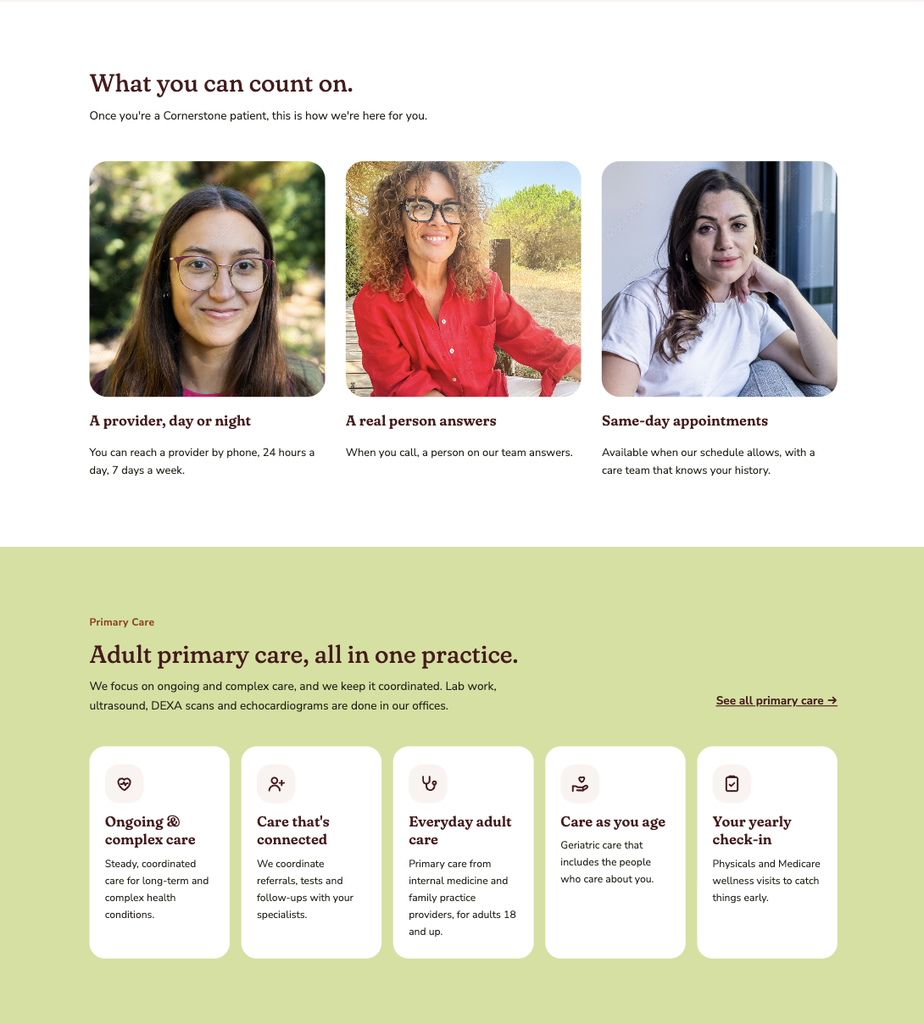
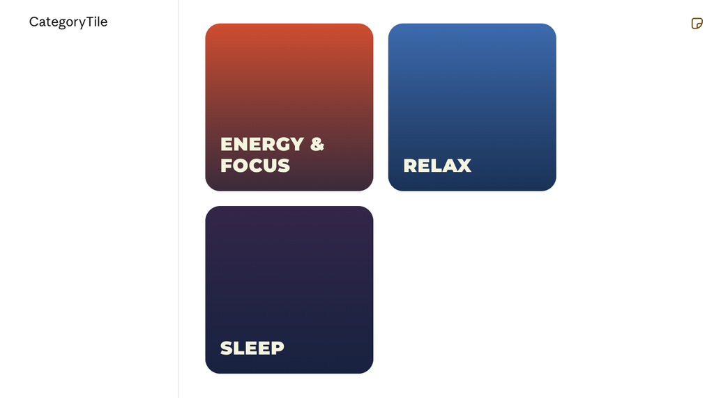
We’re doing exactly that for a client right now. Like a lot of people, they find it easier to react than to describe. They can’t always put into words what they want, but they know right away what they don’t like. So before our discovery call, we built three distinct visual directions using their content, their branding, and their imagery. Each one is polished enough to react to, with no imagining required. We used to bring mood boards and theme options to a meeting like this one and then walk our clients through hypotheticals, helping them to see their brand in our examples. In the same amount of time, we can now show full concepts that are fully branded and on message.
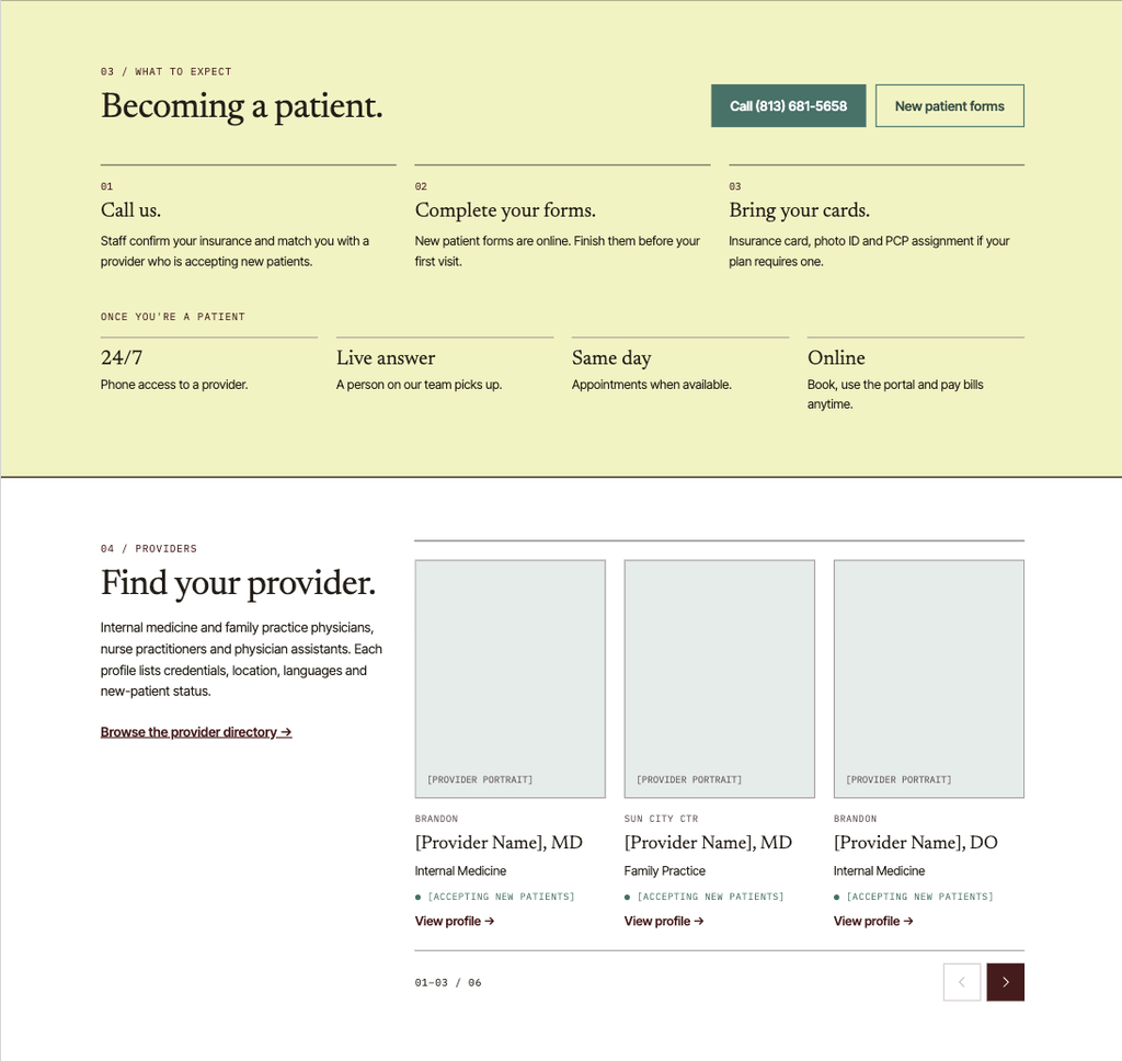
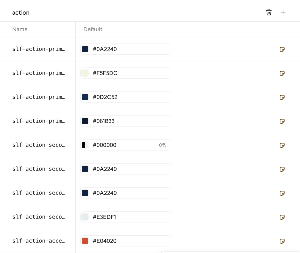
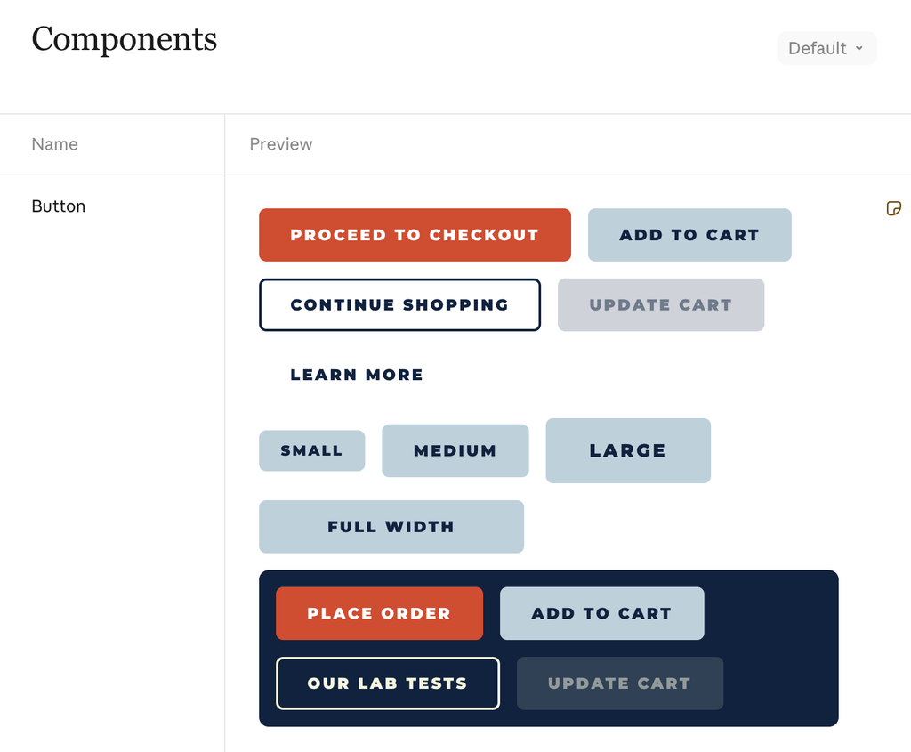
Wireframes used to be floor plans: gray boxes, basic fonts, placeholder Latin (“lorem ipsum”) and a lot of explaining, mostly about why the designs were in another language. Now we start by building a design system from the materials our clients already have, like their logo, current site and brand guide. A working first version takes minutes. Our designers then use the time we saved to refine it, share a concept and refine again. Our process of iteration hasn’t changed. What has changed is the conversation about it. We used to ask clients, “How many rounds of revisions fit in your budget? How many mockups should we account for?” Now we can ask, “How unique do you want this to be?“, or “How far do you want to push the design?”.
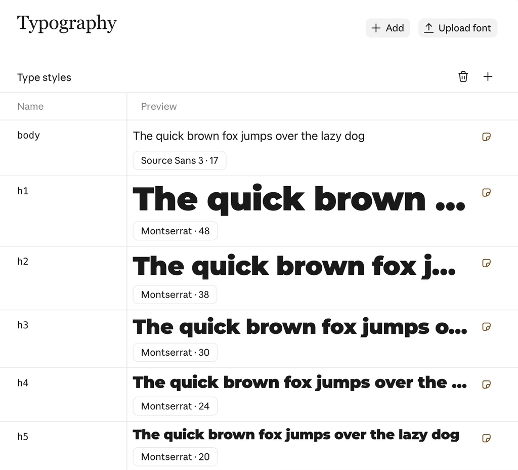
Once the system is finalized, we reference it throughout the build to fill in gaps. It gives visual direction for just about every component we need, from CTAs to cards to filters to forms.
With a design system in place, lorem ipsum is no longer needed. Every wireframe and page template gets real copy written in the client’s voice, then edited by a person on our team. AI writing has habits that are easy to spot once you’ve read enough of it, and our team has seen plenty. Clients review pages that are high-fidelity, in their fonts and colors, and read like their organization from the very first round of designs.
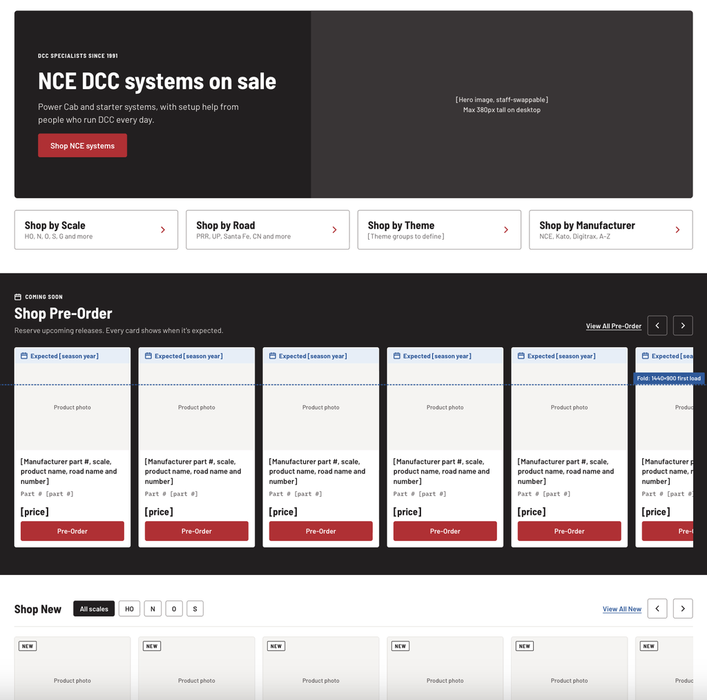
With these changes, it’s now more common for a client to approve a homepage that’s nearly complete. Templates that arrive with real content tend to keep it (why fix what isn’t broken?). That matters because a layout is designed around what it has to say. When the words stay, the design keeps doing its job, and there are fewer revision rounds.
The design system also keeps working long after launch. Many of our clients are small and midsize organizations that have never had a full brand guide. Six months later, someone needs to add a page. We build sites so global styles carry the system automatically, and we leave clients free to adjust things, because it’s their site. The design system gives them that freedom with guardrails. When someone wonders what color a button should be, the answer is easy to look up.
We use an AI-assisted process to produce website audits for existing clients. Before any audit goes out, our team reads it, and we regularly catch mistakes. The AI describes functionality that doesn’t exist, or says a feature is missing when it’s right there. It references pages that are hidden from visitors. Site search trips it up often, because it can’t always tell what a search will return or how it works.
The subtler miss is the context because AI might recommend something that’s already scheduled on that client’s project. It’s a reasonable suggestion, and it would also earn a polite “yes, we’re already doing that” from the client. Only someone who knows the account can catch that.
Designers elsewhere are seeing the same thing. In a Nielsen Norman Group survey of 521 UX practitioners published in October 2026, output quality was the most-cited barrier to using AI.
That’s why some steps stay firmly with people. UX quality assurance is the clearest one, and that step goes beyond pass or fail. It asks whether we built the right thing for the client’s visitors. Someone has to put themselves in a user’s shoes and actually go through the site the way that user would. AI tools can’t always replicate that path. When they hit a roadblock, they tend to guess, and they guess with confidence. The same survey found that 61% of UX practitioners never use AI to interview users and 51% never use it to test designs with users. We take that as a sign of where people still trust their own eyes.
We do use AI to streamline the pass/fail side of QA. It can check that colors, fonts, and general styles follow the design system. It can also find broken links, missing content, and watermarked photography, and it can assess site speed and recommend improvements. Handing off that kind of checking gives us more time for the QA that matters most: did we build the right product? That question decides whether the website will actually perform for our clients and their users.
Sites built mostly by AI tend to look good, like really good. Clean layouts, tasteful gradients, lovely fonts and colors. As a visual person, I can see the appeal, and for some projects it’s a reasonable place to start.
The challenge is that they look good in the same way. Same sections in the same order, same phrasing, same border treatment around rounded corners, same ways to create emphasis in a heading (think italics or color shifts), same stock-feeling imagery.
It’s hard not to notice, and designers and clients alike are starting to feel AI fatigue. Gartner reported in June 2026 that 49% of U.S. consumers say generative AI has made the content available to them worse. Gartner analyst Kate Muhl summed it up: AI “is increasing the volume of media that consumers encounter, but not necessarily the value.” We feel it inside our own agency too. We use these tools every day, and we still get tired of the sameness.
That’s also our answer when a client arrives with a design they built using AI. We’re glad to see it, because it tells us a lot about what they want. A design file is only part of a website, though. It still has to be built so the client’s team can edit it, so it loads quickly, so it works for people using keyboards and screen readers, so it can get found by search, and so it holds up when real content and real products go in. We keep what works, question what doesn’t, and build it properly.
Our goal is to use AI to get to a strong foundation faster, then spend our time on what makes the site recognizably the client’s own. That includes a design system built from their actual brand, copy edited until it sounds like them, imagery chosen to support their message, and a structure shaped by their own visitors’ behavior.
Every project is different, so we don’t promise a set number of extra pages or features. What changes is how much evidence sits behind each decision, and how early clients see something real. We’ve always backed design choices with data and best practices; however, that depth used to take long enough that we saved it for the homepage and a few key pages. Now it can reach much more of the site, and clients weigh in on more of those decisions. They also see realistic design direction sooner, with their own content and brand rules already in it.
Clients also ask where their information goes. We follow a company AI policy, and the AI tools we use don’t train their models on our data, including what clients share with us.
In practice, working with us now looks something like this. The first real conversation (before a proposal may even be signed) happens around the client’s own data. The first designs they see already use their brand, their words and their photos, sometimes in three different directions. And when something isn’t right, we can change course without anyone feeling like a week of work went in the trash.
So, why hire an agency? Because someone still has to make the decisions. AI can tell us that 138 people used a comparison tool last year. Deciding what to do about it takes someone who knows the client’s business, their customers, and how websites actually get used.
If you’re planning a new website or wondering what yours could do better, we’d like to hear about it. Tell us what you’re working toward, and we’ll show you how we’d get there, starting with your own data and brand.