Your homepage is often your audience’s first introduction to your brand, which is why a good homepage design is a crucial part of every website. The challenge is that you only have a few seconds to make a great first impression, guide users to where they need to go, and communicate your value proposition. On top of this limited window of opportunity, as time goes on, homepages can become cluttered, overloaded with information, appear outdated, or worse, create a perception that no one is home.
The good news? Cleaning up your homepage doesn’t require a complete overhaul or redesign. In this article, we’ll explore practical ways to declutter and improve your homepage design, ensuring it serves both you and your users better, no matter your website platform.
You might be asking, well, what should I include on my homepage in the first place? With homepage design, a good rule of thumb is to have a distinct section to represent and direct users to each main navigation item. If your navigation includes “Services”, “About”, “Visit Us”, and “Resources” and your primary call to action is to “Schedule a Consultation”, then you start with your hero section (top of the page) which would direct users to Schedule a Consultation. Then each section that follows would represent your navigation, providing just enough information to help a user understand what they will find when landing on that page and a clear call to action directing users to that page.
A well-designed homepage serves as the cornerstone of your website, shaping first impressions and guiding visitors toward key actions. By striking a balance between visual appeal and functionality, you create an experience that draws users in and keeps them engaged. To help accomplish this, we’ve put together a list of homepage design best practices that can be applied to any website.
When users land on your homepage, they should instantly know what your site is about and what they should do next. That’s why it’s so important to make your primary message and call to action clear and easy to spot. Start with optimizing the hero section of your homepage (typically the first part of your homepage below the main navigation).
The homepage for Slack focuses on a single and simple message using color to draw the eye and emphasize who their product benefits. This message is further enhanced by their name-dropping of top, recognizable brands that use Slack.
The call to action “Get Started” is inviting and clear. They also provide a moving visual of their platform so a user can quickly get acquainted with their product and see it in action.

A busy-looking homepage overwhelms users and makes it hard for them to navigate to the interior pages of your site, not to mention, muddies your brand’s messaging. Instead, embrace simplicity with your homepage layout. Your design doesn’t need to be packed with every piece of information about your business—just enough to guide users to where they want to go.
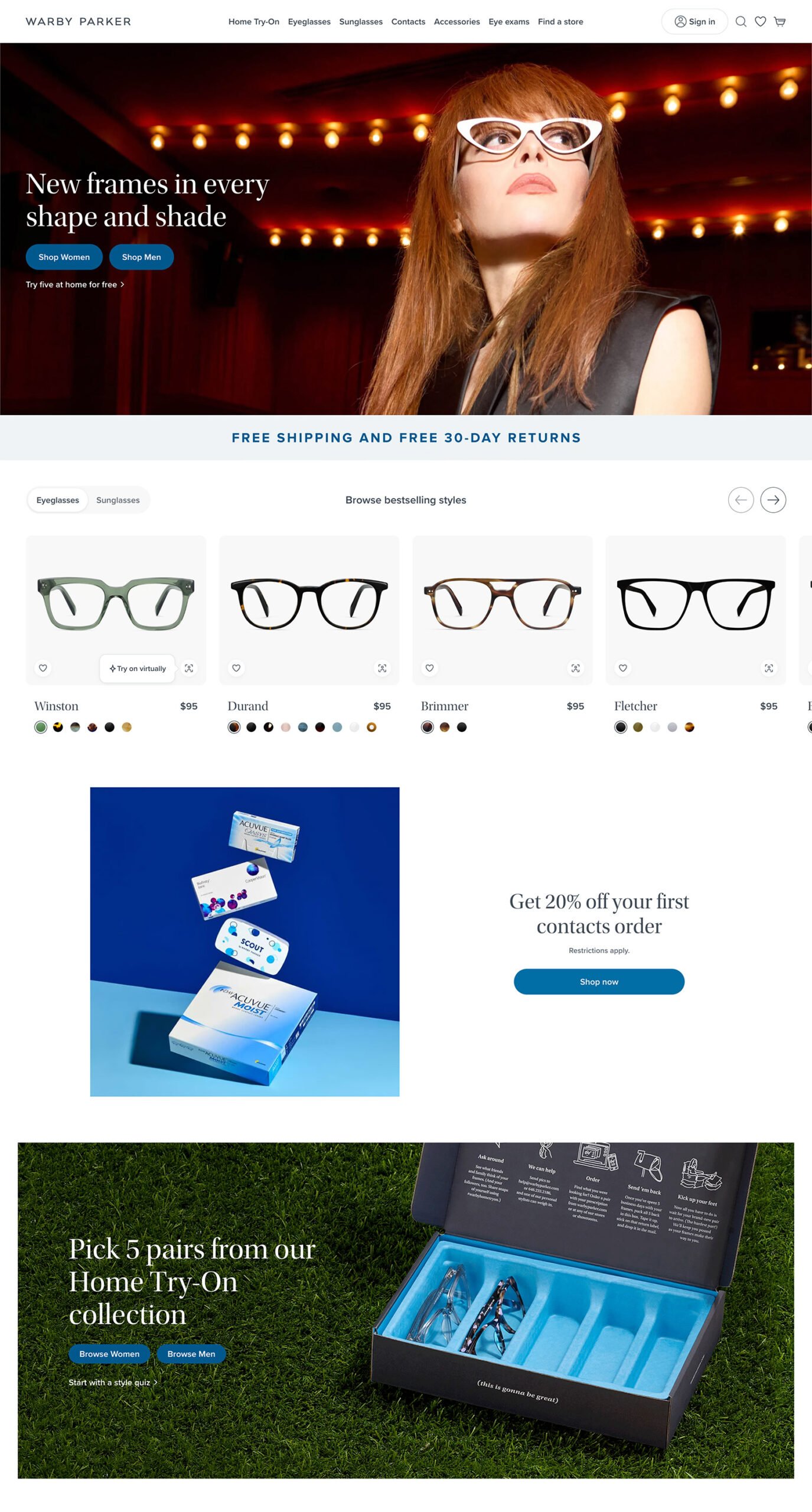
Warby Parker’s site is a great example of a clean and simplified layout. They use high-quality product images paired with minimal text, making it easy for visitors to understand what the site offers. Their use of whitespace ensures the page doesn’t feel crowded, and key call-to-action buttons (like “Shop Glasses”) are clear and inviting. Everything on their homepage is strategically placed to guide users toward browsing products without overwhelming them with too much information at once.
A slow-loading homepage can frustrate users before they even see your content. Site speed plays a huge role in both user experience and SEO. Cleaning up your homepage often includes optimizing it for faster load times.
Sometimes users scroll to the bottom of your homepage without clicking on anything. This is where adding a “Where to Next” section or a quick links bar can be incredibly useful. By strategically repeating important calls to action or popular page links just above the footer, you provide users with a gentle nudge to keep exploring your site rather than leaving.
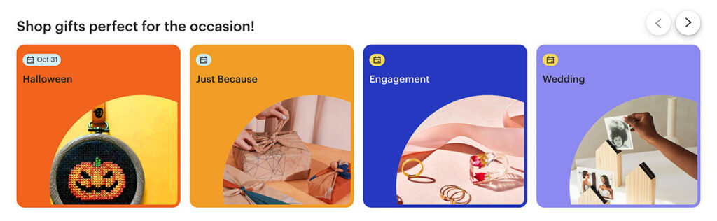
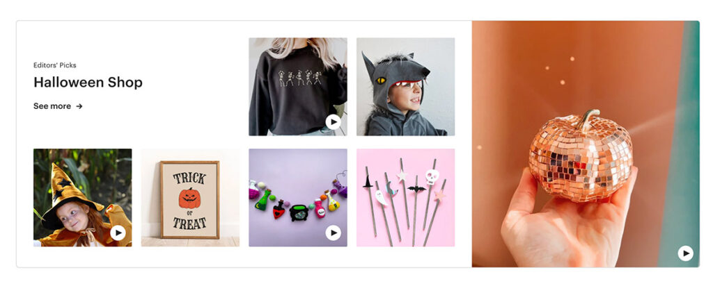
Etsy uses purposeful redundancy to provide users with multiple ways to shop their site. This is immensely helpful for a user who isn’t quite sure what they are looking for right away and needs some guidance. They let a user shop by a category like occasion (Halloween) and also feature a dedicated section to let a user shop by an entire category (also Halloween).
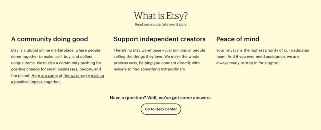
At the bottom of the homepage, they include a section about What Etsy is and then a call to action to invite users to explore the Help Center. They are assuming that if a person has gotten this far, maybe they need some additional help, so why not provide the user with an option to keep exploring?
Cleaning up your homepage design is one of the simplest yet most effective ways to improve user experience and drive more conversions. Whether you’re reducing clutter, speeding up load times, or hitting users over the head (gently) with where to go next, these changes can be applied to any website platform to create a smoother, more enjoyable journey for your users.
Not sure where to start? Reach out to our team of website design experts for a free consultation today.