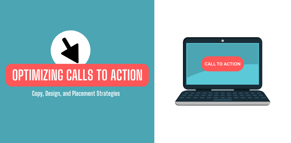
Calls-to-action (CTAs) are critical elements on web pages. They prompt visitors to take a desired action, like signing up for a demo, downloading content, or making a purchase. The specific wording, placement, design, and formatting of CTAs can significantly impact conversion rates. Here are some tips on A/B testing your CTAs to optimize for more clicks:
Types of CTAs
There are several main types of calls to action to test:
- Click-through CTAs: These simply link to another page or resource. Example – “Learn more” or “Download case study.”
- Conversion CTAs: These drive a conversion event like a sign-up or purchase. Example – “Start free trial” or “Buy now.”
- Social share CTAs: These encourage social shares. Example – “Share this article.”
The type of CTA you use depends on the goal you want visitors to complete. Test different verbs and wording for each type.
CTA Copy
The specific text and phrasing of your CTA makes a big difference. Some elements to test:
- Imperative verb: “Download now” performs better than “Download the report.”
- Specific benefit: “Get 20% off your first order” beats a generic “Sign up.”
- Sense of urgency: “Limited time offer” or “Ends soon” can boost conversions.
- Emotional trigger words: “Join now” or “Try it today” encourage action.
Run A/B tests on CTA copy to see which phrasing converts best for your audience.
CTA Design
Visual design elements also impact CTA performance. You can test:
- Colors: Bright contrasting colors like red work best.
- Size: Larger CTAs can draw more attention. Test different padding and font sizes.
- Shapes: Rounded rectangles may outperform plain squares.
- Buttons vs. text links: Buttons can highlight CTAs, but text links look less obtrusive.
- Icons: Try adding icons like arrows or click hand symbols to see if they improve clicks.
The optimal CTA design depends on your site style and layout.
CTA Placement
Where you position your CTAs influences conversions:
- Above the fold: CTAs placed higher up on a page tend to get more visibility.
- Left-side layouts: Items on the left of web pages get more attention.
- After key content: Place CTAs lower down after messages you want visitors to read first.
- Popups: Overlays and popups put CTAs front and center but can also annoy visitors.
Test putting the same CTA in different locations on a page to find the best spot.
Take the time to experiment with different combinations of wording, design, and placement for your calls to action. Small tweaks can lead to big lifts in clicks and conversions. Use A/B testing to continually refine your CTAs and improve results.
How Bytes.co Can Help
Getting CTAs right takes time and testing. At Bytes.co, we offer full-service CRO to optimize your website for more conversions. Our team can help you:
- Audit your website to identify improvement opportunities
- Design, copywrite and A/B test new CTAs
- Analyze data to determine the optimal wording, visual design, and placement
- Continually refine your CTAs over time to maximize clicks and conversions
With Byte’s.co CRO expertise, we can focus on optimizing your CTAs while you focus on your business. Our data-driven approach delivers lifts in conversions and ROI. Contact us today to learn more about our optimization services.