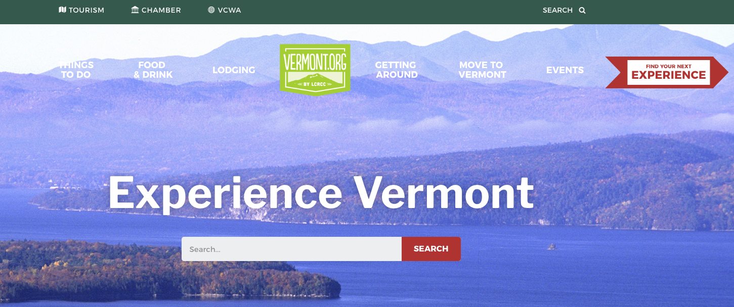


This past summer was an exciting one for Bytes.co with WordCamp Boston and several projects wrapping up. A true highlight from the website design department includes launching the new Vermont.org.
We were thrilled when the Lake Champlain Regional Chamber of Commerce selected Bytes.co to design and develop their new website. Our home was our inspiration. Vermont is a beautiful place, and filled with little discoveries. How could we convey as much of this Vermont experience as possible in the new website? That was the question we asked our selves during the design process, and it came out in many ways. Vivid fall colors on the Leaves for the Peepers page, or an iconic silhouette of the Green Mountains as the site’s footer background, for example.
Our aim here was to have each page read like a piece of prose. This boiled down to 3 different “experience” designs: Lifestyle, Editorial and Maps.
1. LIFESTYLE: Check out Spark in the First Date as an example of this so called “experience template.” The deliberately placed images tell a story with little words, but more importantly, the dating narrative is clear even without having to read the text.
2. EDITORIAL: Templates such as Indulging the Individual are meant to embody a more traditional style, and tell a story in long format. Some larger images here to give viewers that quick visual bite are balanced with the need for a written account of the subject. Related articles are cross-linked on these pages to give visitors more relevant information about Vermont.
3. MAPS: These template follows a typical business listing page, and we stuck this common layout because it is just that– familiar. At the end of the day, visitors need to easily find a campground in Vermont, and the classic layout does just that with simple navigation and basic filters.
As members of the Chamber, it was an honor to provide them with a beautiful website that draws visitors to local businesses.
While we work with organizations of all sizes, there is a special sense of accomplishment in watching our websites help grow a small business. When Pete started what was then Burlington Bytes, it was largely with the intention of helping small businesses boost their bottom line (pretty sure we even used that tagline in some early marketing collateral). The new Vermont.org follows this vision, and is all about helping visitors find the people and places that make our State so special.