On behalf of the digital accessibility community, we’d like to thank you for your commitment to providing a website experience that is available to everyone, regardless of ability. Having an accessible website is something to be very proud of. Now that your website is WCAG conforming and accessible, you need to help keep it that way. Our website accessibility checklist outlines what that commitment means and the techniques needed in order to ensure the content you add is accessible from the time of publishing.
Website accessibility is a term that means a website is usable by all people, regardless of their ability. There are a variety of methods that people use to access the web. Tools used by individuals with disabilities are called assistive technologies. To ensure an equally excellent experience for all users, websites need to work with a variety of assistive technologies. The way to do this is by following the rules of accessibility as governed by the Web Content Accessibility Guidelines, or WCAG.
WCAG is a set of guidelines that has been developed that if followed, ensures your website and content will be usable by all users. There are 3 levels of WCAG and each have a set of Success Criteria that must be met in order for a site to be considered “conforming”. Those levels are: A (single A), AA (double A) and AAA (triple A).
Each level builds upon the previous (meaning that in order to achieve AA, the site has to meet all of the A success criteria in addition to the AA success criteria. WCAG Single A is the easiest level to attain and Triple A (AAA) is the most challenging. Most laws related to accessibility require level AA.
There are three primary reasons that website accessibility is important: social responsibility, legal protection, and good business. The internet has the power to break down barriers and put people from all walks of life on an equal playing field. In many countries, including the United States, having an accessible website is required by law. An accessible website is usable by more people, and therefore has an increased potential customer base.
Approximately 1 in 4 people have some sort of disability that impacts the way they interact with a computer and the internet. Some of these people have permanent disabilities while others’ have conditions that are temporary. As we all age, the chance of losing your sight or hearing is very high. Website accessibility means that your website will be accessible and usable by all people, including those with disabilities who use assistive technologies such as screen readers, zoom text, sip and puff devices, and many more.
We’ve put together a website accessibility checklist of items that you’ll need to be aware of while adding content such as blog posts, new pages or adding content to existing pages. The following checklist will walk you through the different techniques you’ll need to follow in order to keep your website accessible. You’ll need to ensure you are following all of these guidelines every time you add content to your site.
The first item on our website accessibility checklist is to write descriptive alternative text (alt text) for all images on your website. Users with low vision often make use of talking browsers, or screen readers, to “read” the web. These specialized browsers convert text to speech so that a user can hear the words on a site. When a screen reader lands on an image, it looks for alt text that it can read aloud; if it finds none, it will often just say “image”, leaving the user in the dark as to what the image is and how it matters to the story.
Describe all of the elements that explain what’s happening in the image, rather than just setting the alt text to be something like, “photograph”. A good example of descriptive alt text for the following image is “White trillium flowers in bloom in a forest”.

If you have to use an image of text, be sure to describe the design if relevant, as well as all of the words in the image. (Example: Whiteboard drawing of the quote “Nothing for us without us”).
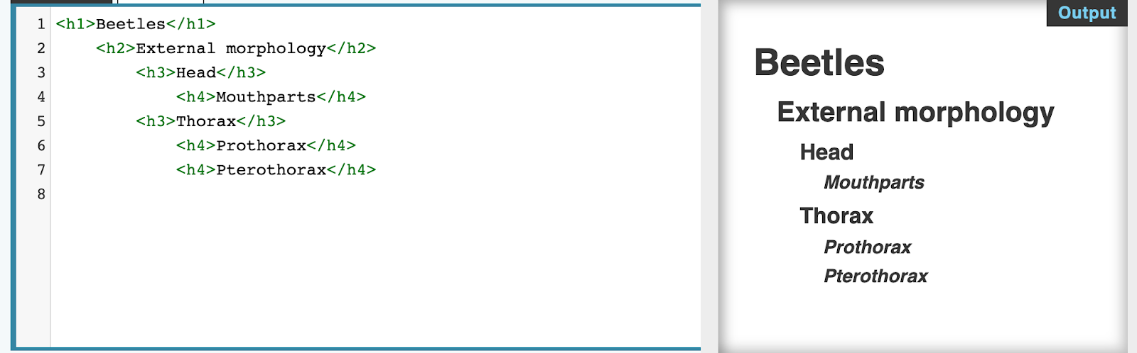
Be clear in copy, avoid jargon and idioms, and use section headings to organize content. Keep headings in logical order (H1, H2, H3, etc). Avoid skipping heading levels and make sure you use headings to denote meaning, not just to style text.
Example of proper usage of headings:
When you use abbreviations, make sure to write out the whole name first with the abbreviation in parentheses. Example: Web Content Accessibility Guidelines (WCAG).
Assistive technology like screen readers are able to find all links on a page and present them in various forms, but these links are rather useless if it’s a long list of links that are just the text “click here.” A better way is to have the link describe where the user will go if they click it, giving them an idea of what’s on the other side of clicking.
Use descriptive text for links instead of words that provide no context (“Read Our Shipping Policy” versus “Read More”).
You should not rely solely on images, shape, size, visual location, orientation, or sound to indicate important instructions for operating or understanding content (Example: “See the image above”). Instead, use a combination of positioning, color, and labeling to identify content.
There should be another indicator (such as icons to accompany color coding, or an underline on linked text) so that people who cannot easily distinguish colors will be able to understand and use your content.
Example Failures:
Synchronized captions are provided for non-live, web-based video (YouTube videos, etc). YouTube and Google provide tips on creating and editing video captions.
Audio descriptions are provided for all video content. This is only required if the video conveys content visually that is not available in the default audio track. To see/hear an example of an audio description, see this clip from The Hunger Games on YouTube. All Netflix videos have audio descriptions, so you can toggle those on to experience it on a different platform. PennState University has a guide about audio descriptions that includes information about creating them.
Web pages can not contain anything that flashes more than three times in any one second period, or the flash is below the general flash and red flash thresholds. Individuals who have photosensitive seizure disorders can have a seizure triggered by content that flashes at certain frequencies for more than a few flashes. People are even more sensitive to red flashing than to other colors.
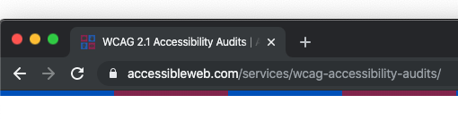
Descriptive page titles identify the current location without requiring users to read or interpret page content. When titles appear in site maps or lists of search results, users can more quickly identify the content they need. User agents make the title of the page easily available to the user for identifying the page. For instance, a user agent may display the page title in the window title bar or as the name of the tab containing the page.
Here is a live example of a descriptive title tag:
Make sure your PDFs are accessible. Unfortunately, PDF accessibility techniques are a much bigger topic than we can tackle here. If you want to know how to make accessible PDFs, here are some resources:
Requirements for an Accessible PDF
PDF Accessibility – Deque University (online course)
But before you jump into making your PDF, ask yourself if that content really needs to be a PDF. More often than not, it would work just as well as a web page. If you’re trying to get people to share content information by offering them downloadable content, see if you can build pages behind a login or generate unique access URLs. If you think it’s the kind of content people would really want to be able to download, offer an accessible PDF in addition to the accessible web page.
The contrast ratio between text and the text’s background should be at least 4.5 to 1. If your font is at least 24 px or 10 px bold, the minimum drops to 3 to 1. Be especially careful with text over images.
The following tools help you figure out what color contrast ratios your color choices are or help with selecting accessible color palettes:
If you need to find the color hex codes for colors on your site, the following eyedropper tools are helpful:
The last item on our website accessibility checklist is to avoid using just color to indicate important information. There should be another indicator (such as icons to accompany color coding, or an underline on linked text) so that people who cannot easily distinguish colors will be able to understand and use your content.
Example Failures:
By following best practices and by using the recommendations listed in here in our website accessibility checklist, you’ll be on the right track to keep your website accessible for everyone. However, it’s still important to audit your website every so often to ensure that WCAG compliance is being maintained. We work with Accessible Web to audit clients’ websites and to resolve any accessibility issues that may arise. Contact us to schedule a free website consultation and to learn more about our website accessibility services.