Home  /  Portfolio  /  Conversion Rate Optimization (CRO)  /  People’s Credit Union

website design

People’s Credit Union

A credit union and community-based financial institution serving Rhode Island.

Since their inception in 1922, People’s Credit Union has been focused on “people helping people”. To them, this means working to build strong connections with their members in order to better understand their needs. Their services include everything from insurance and mortgages to business loans and savings accounts.
Visit their website

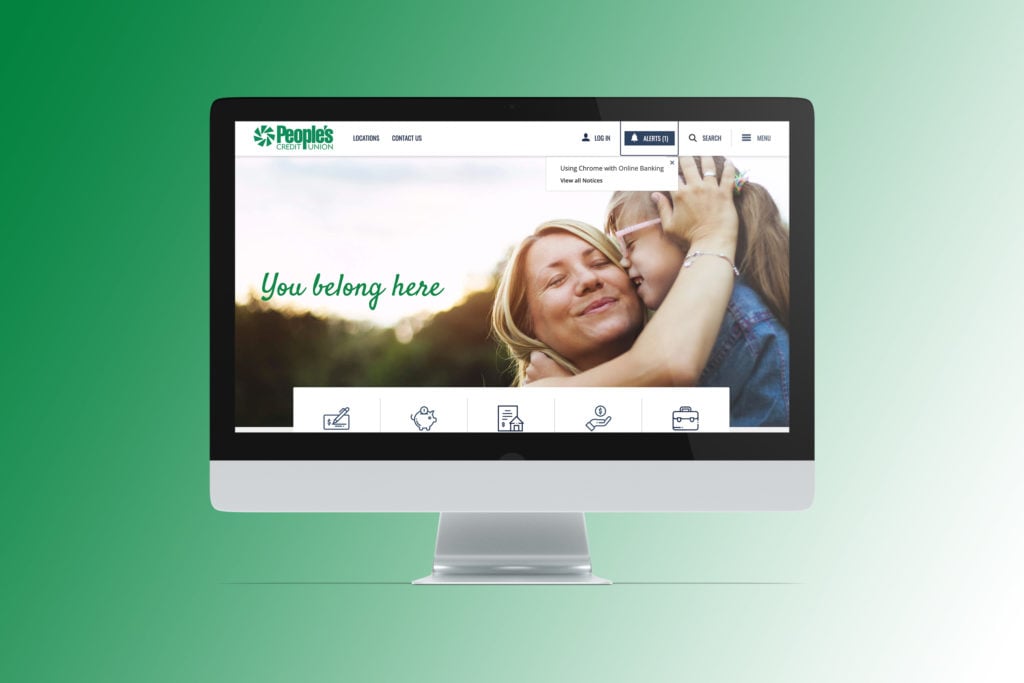
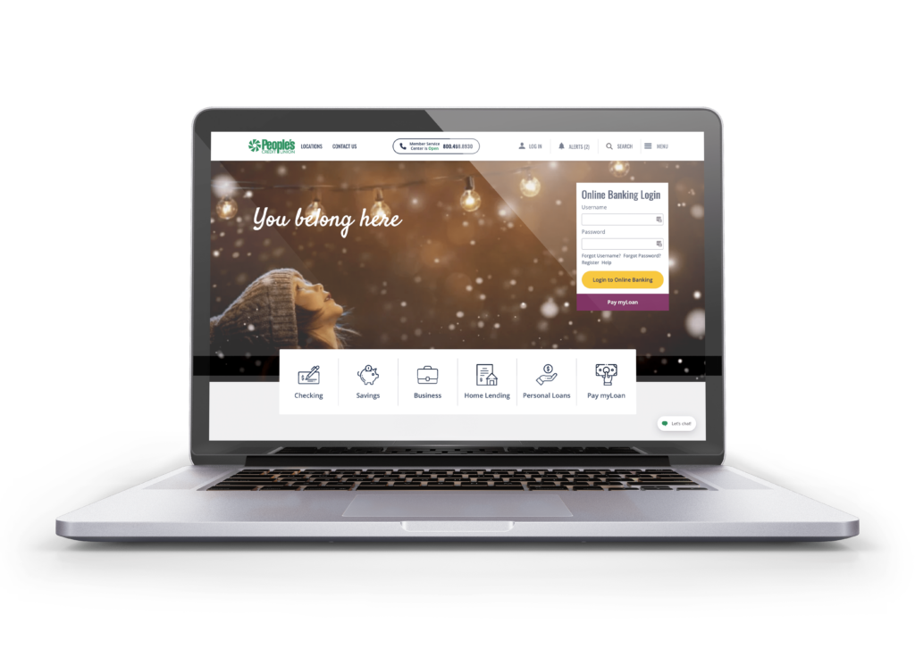
People's Credit Union homepage on laptop

Project Details

  • TECHNOLOGIES USED
    • WORDPRESS
    • GRAVITY FORMS PLUGIN
    • MODERN TRIBE EVENTS CALENDAR PLUGIN
    • RELEVANSSI PREMIUM PLUGIN
    • TABLEPRESS
  • KEY HIGHLIGHTS
    • Website Built to Meet WCAG Level AA accessibility standards
    • PRODUCT WIZARD THAT GUIDES USERS THROUGH MAKING AN ACCOUNT SELECTION IN A DYNAMIC WAY
    • TIME VALUE FINANCIAL CALCULATOR INTEGRATION
    • A/B TESTING & USER BEHAVIOR ANALYSIS TO OPTIMIZE WEBSITE
Person holding a phone with the people's credit union mobile menu opened

Website Design

The Challenge

People’s Credit Union wanted a new website that would be reflective of their in-person banking experience: personalized, thoughtful, and hassle-free. This meant that the new website would need to quickly serve up relevant information at the time the customer would most benefit from it, as well as provide the same resources they’d have access to in-person. Overall, the main goal was to easily guide users through the sales funnel, as well as structure the new site to cross-sell products and services more effectively. Furthermore, this new website would need to have an improved experience for all users, making web accessibility a priority.

Our Approach

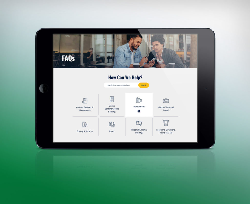
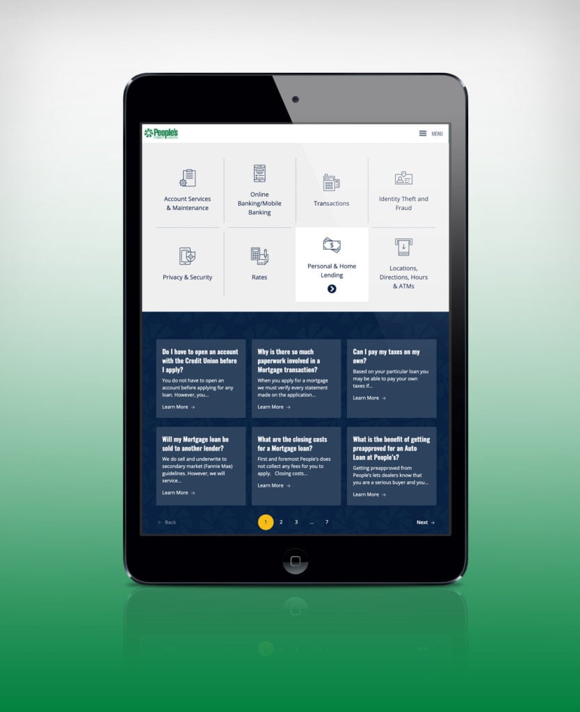
To achieve these goals, we built People’s Credit Union a new WordPress website with an updated, clean design. We also made sure that the new online experience would match that of their in-person banking experience by making it easy for users to access online banking and the answers to their questions via simplified service breakdowns and helpful FAQ sections. Additionally, to ensure that all users would have an improved experience on the People’s Credit Union website, we built it to meet WCAG Level AA accessibility standards. Finally, we also created a new admin area that would allow the People’s Credit Union team to easily update, add, and curate information.
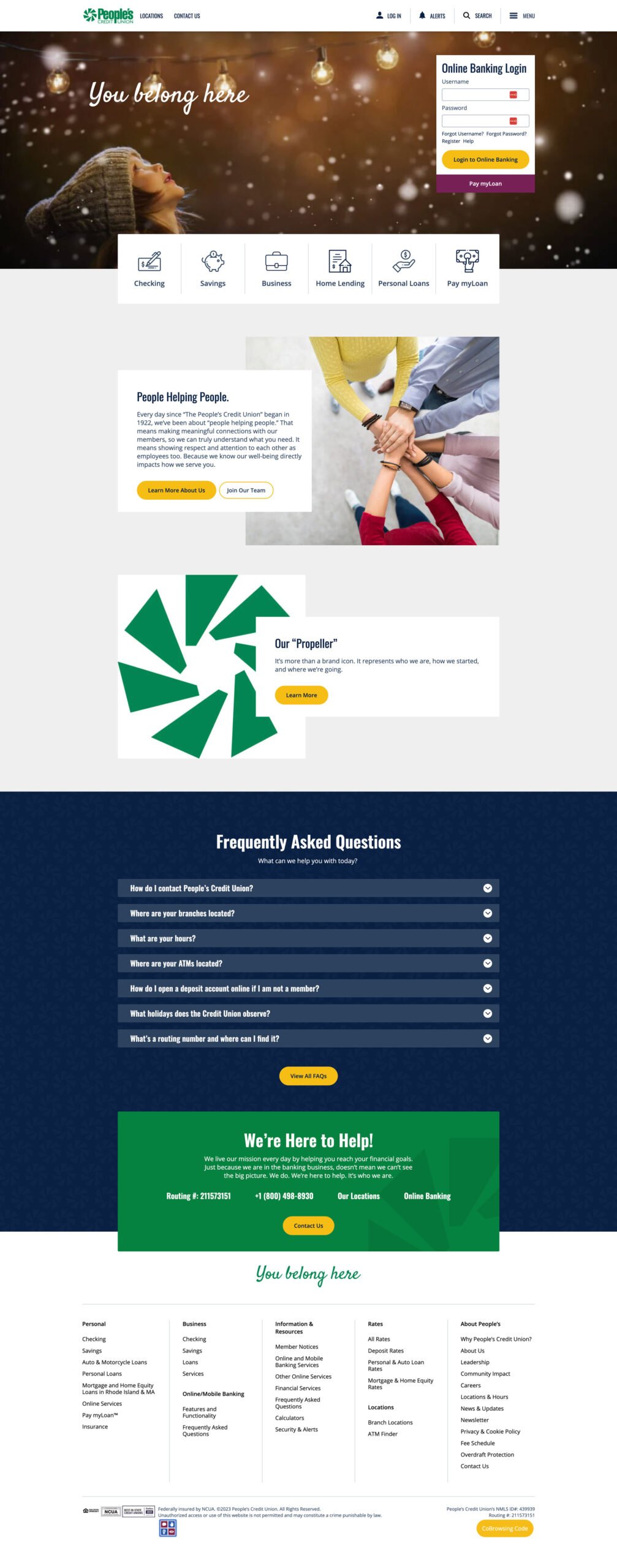
United Counseling Service full homepage

Homepage Layout & Design

Gives users an immediate feel for the People’s Credit Union brand as well as their many available services and resources.

  • Online Banking Login Portal
  • Services Breakdown
  • FAQs Section

Visit the Website

Conversion Rate Optimization (CRO)

A few years after our website redesign for People’s Credit Union, they signed on for our conversion rate optimization (CRO) services, specifically a combination of A/B testing and user behavior analysis. Since then, our team has successfully run experiments and gained insights on how to improve user experience and increase conversions on the People’s Credit Union website – a few of which are outlined below.


A/B Testing Buttons on Personal Checking Pages

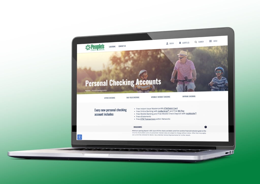
One of the first A/B testing experiments we ran for the People’s Credit Union team was on the call-to-action buttons on their personal checking pages. This test compared one button opening a modal window (the original variant) against two buttons with no modal. The ultimate goal was to see if removing the additional click within the modal would result in a higher conversion rate for those looking to open their account, as well as a higher conversion rate for those looking to become a member.

This test ran over the course of a 40 day time period, and the final test results indicated that having two buttons instead of one led to a higher conversion rate for the Open Account goal. Although the Become a Member goal was not as statistically significant, the two button variant still had a 96% probability of being the best. As such, our recommendation was to implement the test variant as a permanent design change.

A/B Testing Removal of Duplicate CTAs on a Personal Savings Page

Another A/B test we ran on the People’s Credit Union website took place on one of their personal savings pages. This test focused on removing one of the two “Here to Help” CTAs on a personal savings page, the hypothesis being that the test variant with less redundant CTAs would ultimately drive more conversions.

This test ran over the course of 23 days, with the test variant driving double the conversions and a higher conversion rate than the original with duplicate CTAs. The test variant also had a 94% probability to be the best, further confirming our recommendation to make this change on all pages for consistency. 

User Behavior Analysis on Alerts Pop-Up in Mobile Menu

One of the biggest discoveries of our user behavior analysis efforts was a user experience (UX) barrier in the mobile menu. Initially uncovered through screen recordings, this issue occurred as mobile site visitors attempted to open the main menu and were immediately hit with an Alerts pop-up. Users were not only attempting to close the pop-up without reading it first, but were also physically unable to do so as the “X” button was too small. As a result, a surplus of rage clicks were being recorded.

This UX issue was further reinforced and elaborated upon by heat map analysis. Since users could not exit out of the pop-up, they were then unable to access the important service links hidden underneath. We immediately implemented this change, updating the default Alerts pop-up status from open to closed for mobile device users. Since then, the previously blocked service pages in the mobile menu have received a significant increase in both sessions year over year as well as engagement on mobile heat maps.

Hear From People’s Credit Union

Bill Dewitt

2020 was an unforgettable year, but one of my highlights was working with Bytes.co and launching our new website.
View Case Study Bill Dewitt

Browse Related Projects

View More

Skip Footer