website design
Bank of Burlington
A new leader in the local Vermont financial industry.
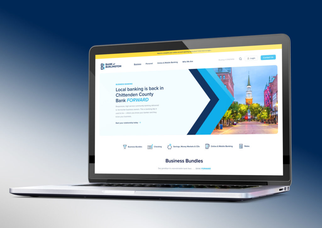
With only one physical location, Bank of Burlington operates almost entirely online – meaning that their website is the main gateway for clients to access online banking services, news, contact information, and more. Given the heavy emphasis placed on the Bank of Burlington’s online presence, we’re honored to have been trusted with the build of their new website.
Project Details
- SERVICES USED
- TECHNOLOGIES USED
- WORDPRESS
- WPFRONT NOTIFICATION BAR PLUGIN
- GRAVITY FORMS PLUGIN
- KEY HIGHLIGHTS
- Q2 LOGIN EMBED
- Davey Awards Silver Winner 2023

The Challenge
Since Bank of Burlington’s website was to be their primary touchpoint for clients, it needed to convey the professionalism, security, and trust of a local bank while also showcasing its modernized, tech-forward nature. Making it easy for a user to view available services and sign up for an account was essential to the success of the bank’s online experience. The website also needed to ensure that users left the site understanding that Bank of Burlington is a different kind of financial institution—a local, tech-forward bank with a focus on the thriving Vermont business community.
Our Approach
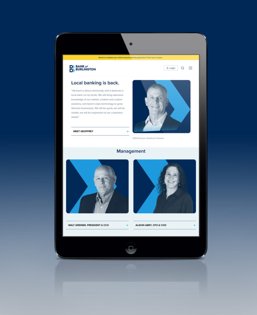
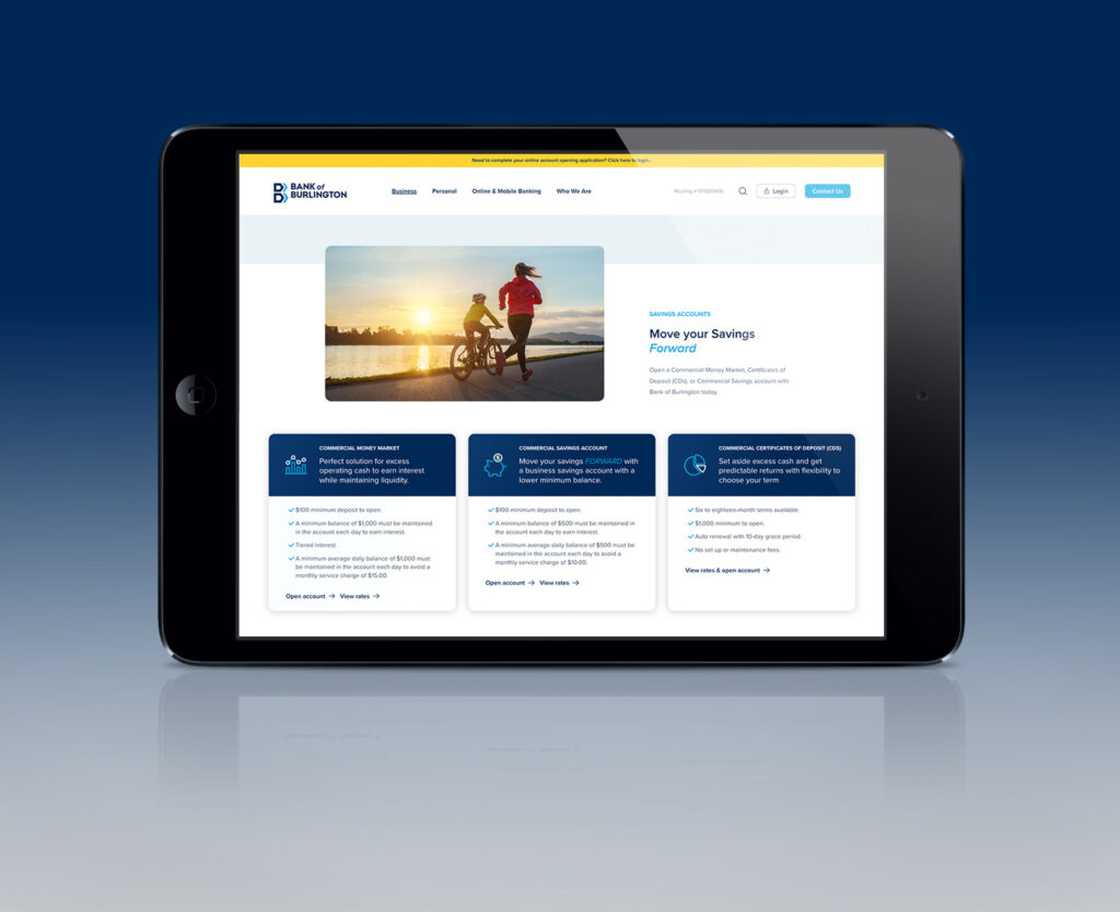
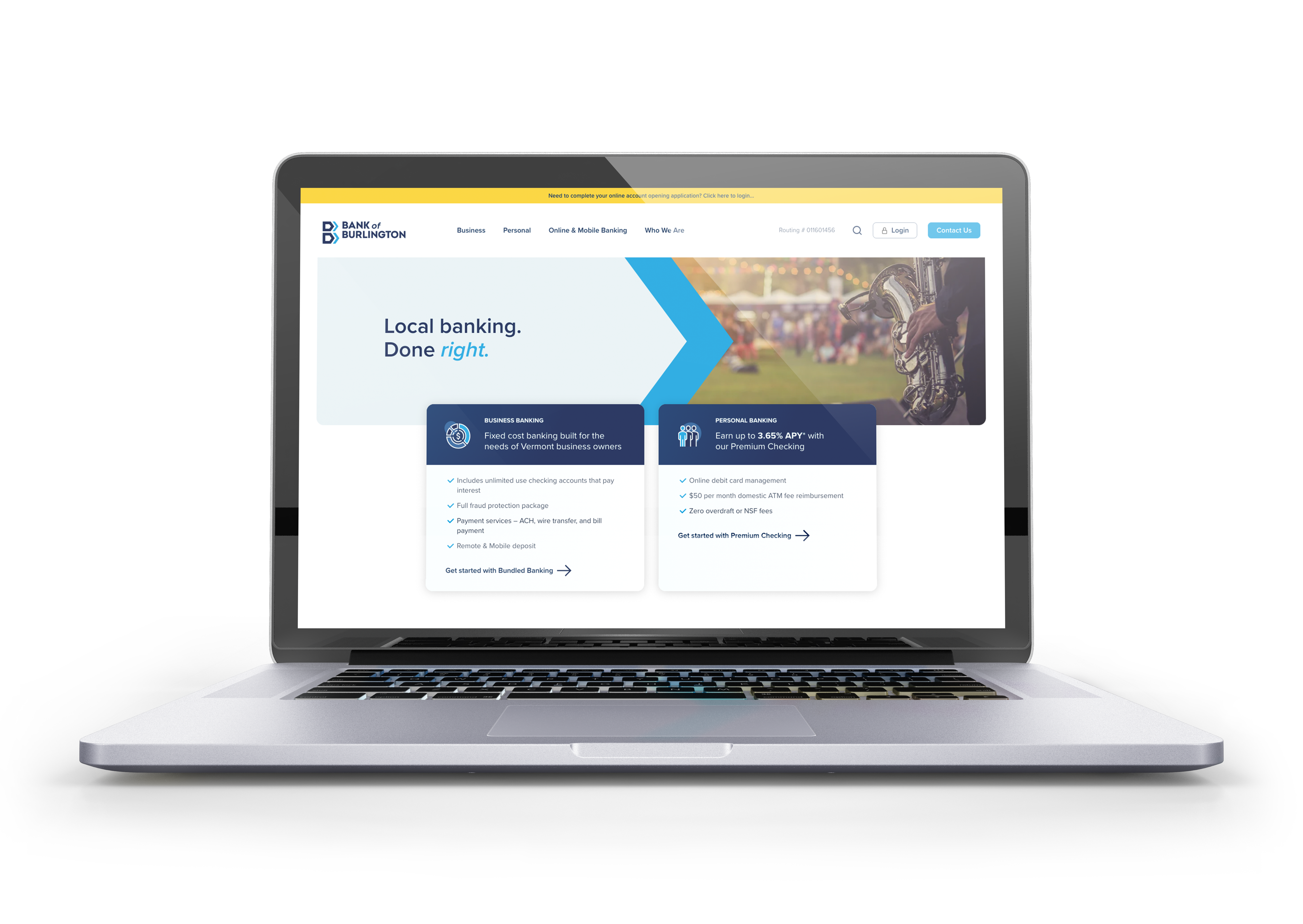
Keeping this list in mind, we built Bank of Burlington a new, highly secure WordPress website with a design that balances a local Vermont vibe with a high-tech, cutting-edge feel. Streamlined navigation, clear banking login, and concise content sections make for quick browsing of the site. Clients can also log in to their online banking account through a secure form. We were thrilled to have the opportunity to work with such an exciting, new banking institution in the Burlington, Vermont area.
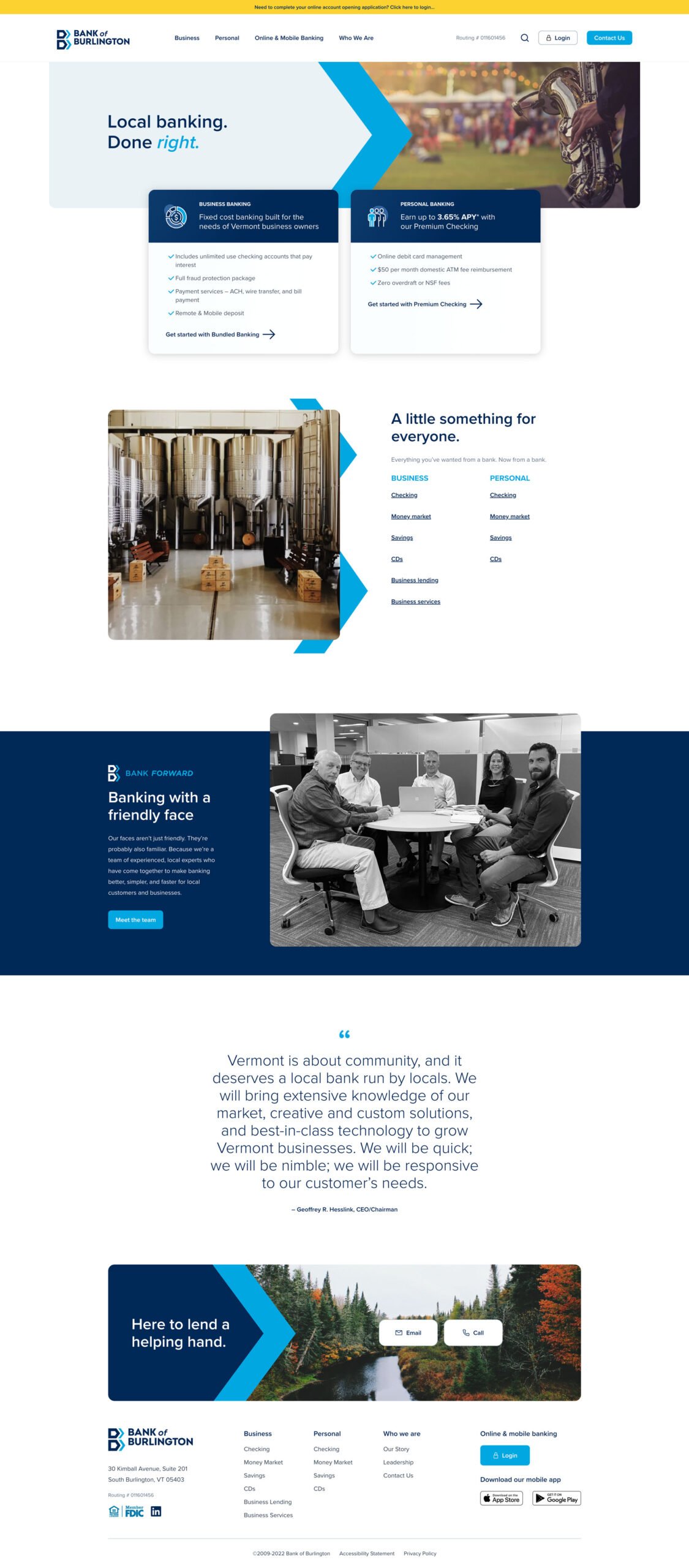
Homepage Layout & Design
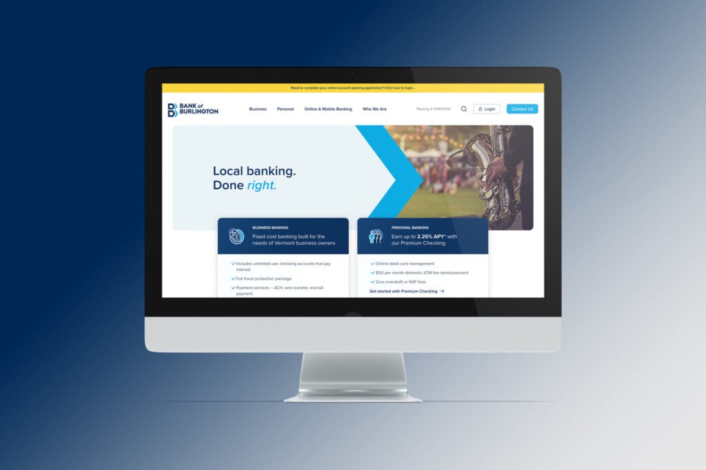
This custom design features a modern design aesthetic and purposefully redundant navigation to keep the user engaged as they scroll.
- Audience segmentation above the fold
- Quick links to access services
- Calls to Action strategically located for easy navigation

