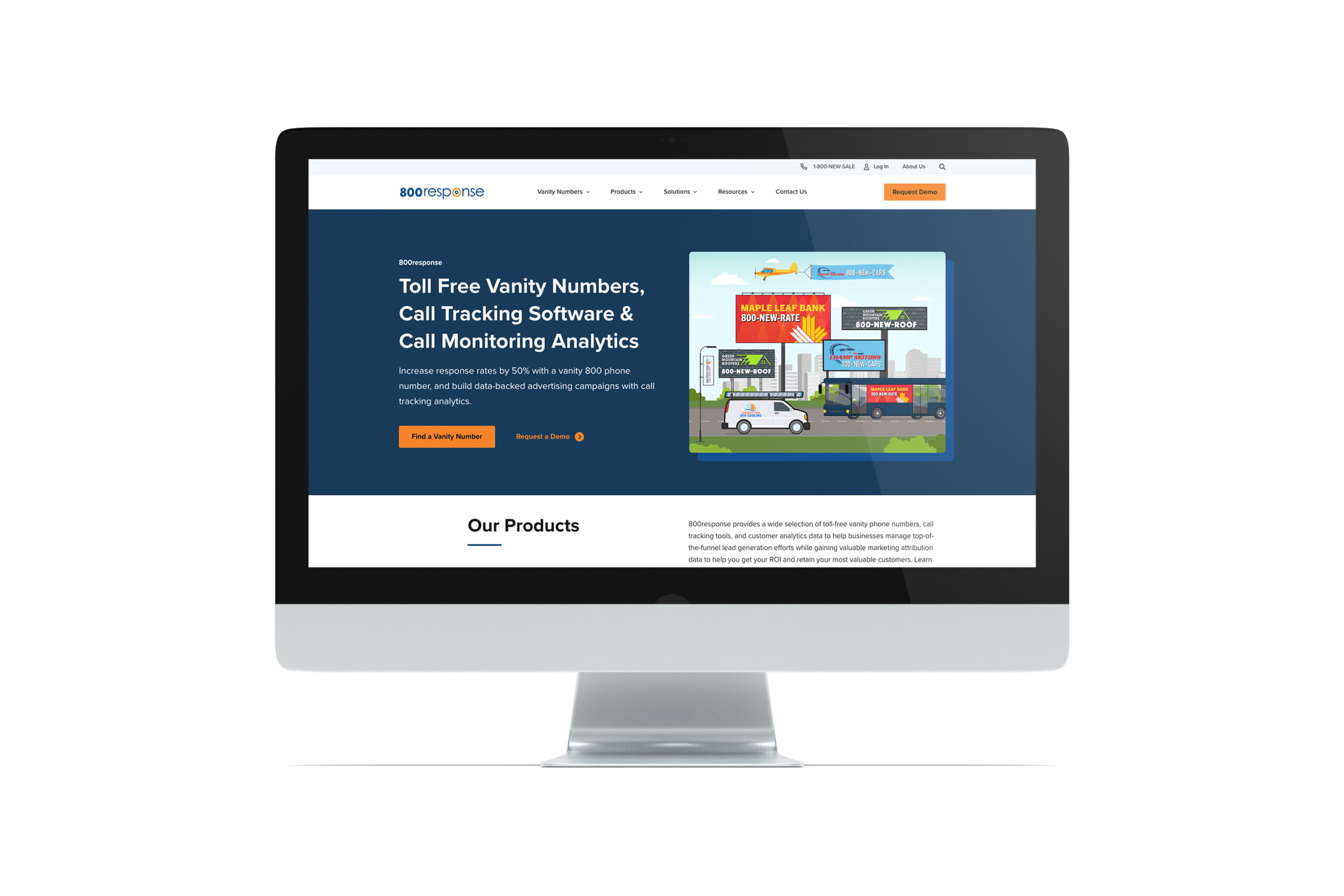


800response is a SaaS company providing unforgettable vanity 800 phone numbers, advanced call routing, and sophisticated call tracking solutions to help businesses increase response rates to their advertising and improve ad ROI.
The Bytes.co team had been working with 800response prior to the website rebuild, assisting them with SEO services and refining their sitemap. We were very excited to get the opportunity to rethink their website design and to provide an enhanced user experience to their customer base.
800response was already on WordPress. However, as we typically see with older WordPress sites that are built prior to Gutenberg and are not using any page builder plugins, like Elementor or WP Bakery, 800response’s content was built within custom fields with the display of these custom fields hard-coded in the template.
Why is this an issue? Well, it’s not if you’re going to have the same amount of text and images on every page and you’re always going to display those text and images in the same order and in the same way every time. This approach is great for ease of data input and ensuring all pages look the same, despite who works on them. It’s also a solid approach for clients who know very little about WordPress or building websites—they just copy/paste the text into fields and voila! Everything displays correctly every time.
However, 800response was in need of a lot more than hard-coded templates and wanted way more flexibility in what and how they were presenting information on a page. And, with Gutenberg as the built-in page editor and being able to leverage pre-built patterns, those users who aren’t super familiar with building websites can still employ the “copy/paste” data entry approach while still being able to create beautifully laid out, unique-looking pages. Also, each section of content is modular and movable, so it’s wicked easy to reposition information so it falls higher or lower on a page.
And this is what we delivered to 800response! They got a newly imagined website with a modern, refreshed design that allows for infinite options for laying out content, is easy to use both from an admin perspective and a front-end user perspective, and is fully optimized for search.
Other features of the new website:
On top of it all, the client was just so wonderful to work with and powered through learning how to use a new tool (Gutenberg). We couldn’t be happier with the end result!

