Like a good playlist you can throw on while hanging with friends, I always feel like our website projects vary in depth, range, and audience, providing a mix of genres to keep the conversation lively and create happy anticipation about what may come on next.
Some projects are heady regarding technical complexity and others are all about aesthetics. We also have our fair share of full content reorgs where we have sites with 500+ pages and are completely reimagining the sitemap. Each one keeps me on my toes and I always look forward to the next one in the queue and what opportunities it may bring, be it an opportunity to use a new tool, typeface, color palette, or API (yes, I like working with APIs, namely cross-checking the data between the source and the website).
And like a good playlist, there are songs that you return to time and time again to reconsider a lyric, evoke a memory or feeling, or simply enjoy the production value. If I were to create a playlist of website hits for myself, Artisan Learning would be among them. It would be one I return to time and again to enjoy an aspect of the design or appreciate the animation effects used throughout. It certainly hits all the chords for me! (Pardon the deliberate pun.)
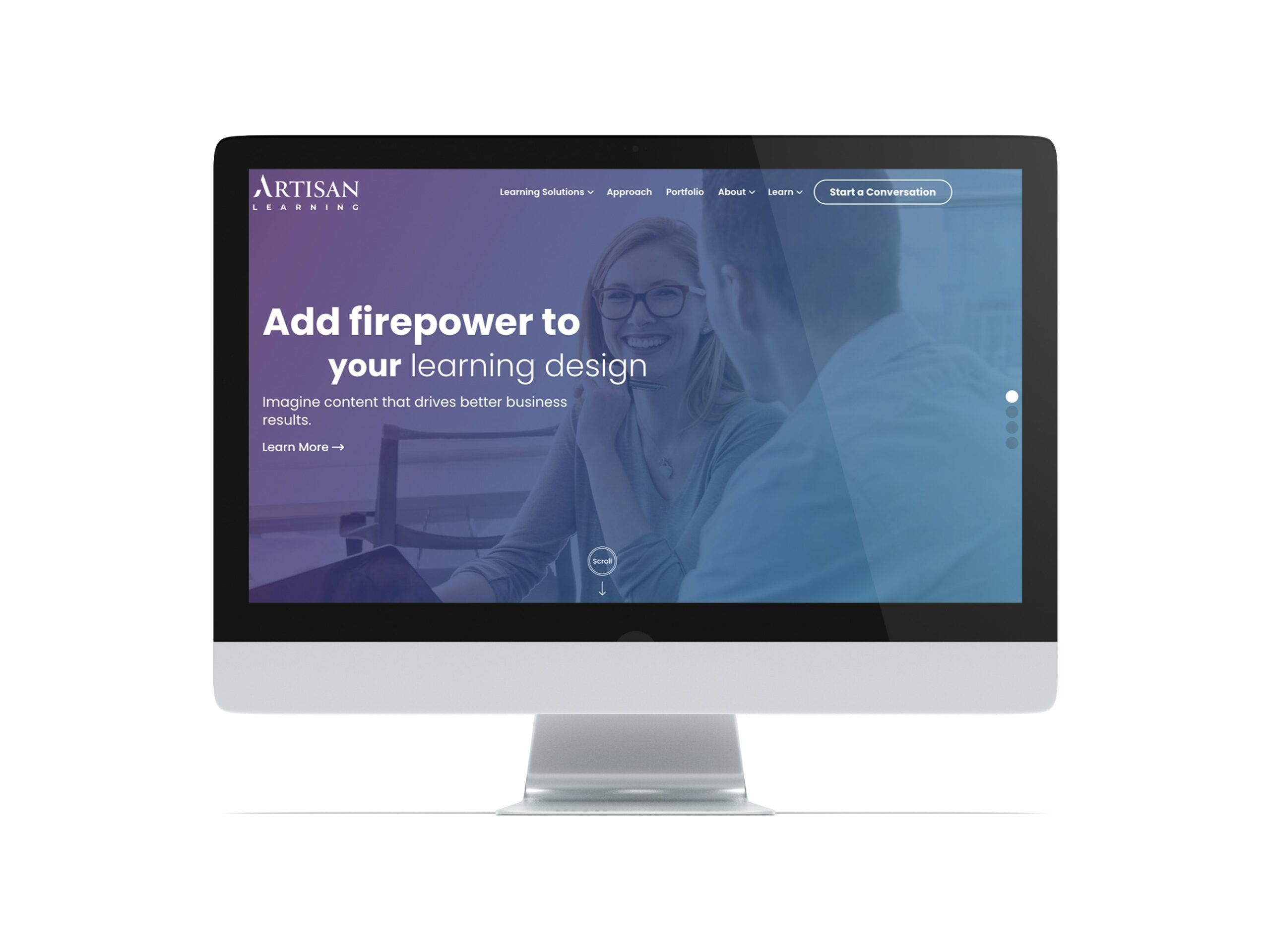
We launched the new Artisan Learning website toward the end of April this year. It was a fully custom, design-forward, WCAG 2.1 Level AA Accessibility-compliant website that came on the heels of a stunning rebrand from our friends over at HMC, a fully-integrated advertising agency located in Burlington, Vermont with offices in Boston, Massachusetts.
While the site itself is less than 30 pages, a lot is going on with it! Let’s tune in for more.
We immediately found a lot of parallels between what we do here at Bytes.co and what Artisan Learning does for their clients. Every new project is greeted as a welcome opportunity to solve a unique set of challenges. The development process is iterative, collaborative, and user-centric, relying on subject matter experts (SMEs) to shape the result—in our case a website, and in Artisan Learning’s case, a custom learning solution.
Artisan came to us with two main requirements. The new site must be accessible and also needs to look unique to them and push the design envelope. They also planned to rework/rewrite all their website content having recently gone through a rebrand and an audit of their brand voice and messaging. Their old site had a long list of pain points that we wanted to make sure we addressed in the redesign. Those were:
We took these considerations and flipped them on their head, turning negatives into positives.
A good story immerses you in the narrative. You feel like you know the characters and are rooting for them. When reading a book, you want to be able to go at your own pace and take in the details without feeling overwhelmed or distracted by noise.
We decided to connect the content and make it feel fluid like you were reading a short story about Artisan when on each page. Even the animation we’re using as you click on a new page echoes the feeling of leafing through a book.
We also wanted to slow down the pace of taking in new information so a user could take time to read a section before moving on.
We achieved this through the following design methods:
Artisan wanted their site to feel entirely unique to them, meaning, we weren’t going to use a pre-built theme for this project and we were going to design from the ground up. While themes have many advantages for our clients and we use them regularly, they are primarily good for getting a site up and running quickly and cost-effectively.
What we did do, though, was use WordPress in a standard way in the admin. In this case, there was no need to reinvent the wheel in terms of how the site was built under the hood. Building a site the “WordPress way” means that the client can edit their content, create new pages, add news items, and manage their site all on their own. We aren’t doing anything out of the ordinary where Artisan would need to contact Bytes.co just to swap out a picture or to add a new section to a page. We also train our clients on how to use their new site knowing that WordPress does change and not every site is the same.
The other feature of WordPress we use on all our builds is to create custom patterns of Gutenberg blocks. This makes it super easy for a client to add a content section to their page because we’ve already built it, styled it, and QA’d it. All they have to do is swap out text and images.
Similar to making a website responsive (mobile-friendly), we don’t wait until the end of the build to go back through and then ensure the site works on mobile devices. We consider both responsiveness and web accessibility at every step of the process. From checking contrast on mockups to scanning global elements like the header and footer to auditing a page template once built, we factor in accessibility as we develop the site so that once we get to the end, all we need to do is run through a QA and confirm that we’ve done our due diligence.
I thought about finding a favorite song that I could use to compare the Artisan Learning website to and decided against taking this analogy that far. . .Also, this isn’t a remix or a cover, it’s a whole new single! The Artisan Learning site is an example of working with a client who has a clear vision and enjoys getting hands-on to ensure that vision comes to life. The website development process was collaborative and iterative, just like Artisan’s process for creating a custom learning solution. The end result is a website we as an agency feel proud of and want to keep showing off as much as possible—just like when you discover that great new track and want to share it with everyone.