
When people visit a real estate website, they’re rarely just looking for a property. They’re trying to answer a much bigger question:
Is this the right place for me?
Sometimes that question is about finding a home where they’ll spend the next chapter of their lives. Other times it’s about choosing the vacation they’ll look back on fondly years from now. Both involve emotion, some uncertainty, and plenty of decisions before someone ever picks up the phone or schedules a showing.
As Creative Director, I spend a lot of time thinking about how websites can make those big decisions feel a little easier and a little less stressful…at least when it comes to browsing for options. Packing for a move or a vacation once you find the perfect place, well, that I can’t help with!
But how people make those decisions depends a lot on the market they’re searching in.
Someone searching millions of properties across the country has very different needs from someone looking within a small island, resort community, or regional market. The amount of inventory is different. The way people think about location is different. Even the information they need to narrow their options can be different.
Large property search sites give us excellent UX patterns to study, and we look to them often. But a search experience designed for millions of listings across thousands of markets may introduce complexity that a boutique brokerage and its users simply don’t need.
If you’re designing or managing a website for a boutique brokerage or regional real estate company, that distinction matters. The goal isn’t to recreate the experience of the biggest player in the industry. It’s about understanding how your audience searches, what information they trust, and what helps them feel comfortable and confident making a decision.
That thinking is an important part of how we approach website redesigns at Bytes.co. We study the patterns that work across an industry, then look closely at how a client’s own audience searches, what information they need, and where their data or market creates unique considerations. Those insights help us determine which familiar patterns make sense, which need to be adapted, and where a different approach may serve the user better.
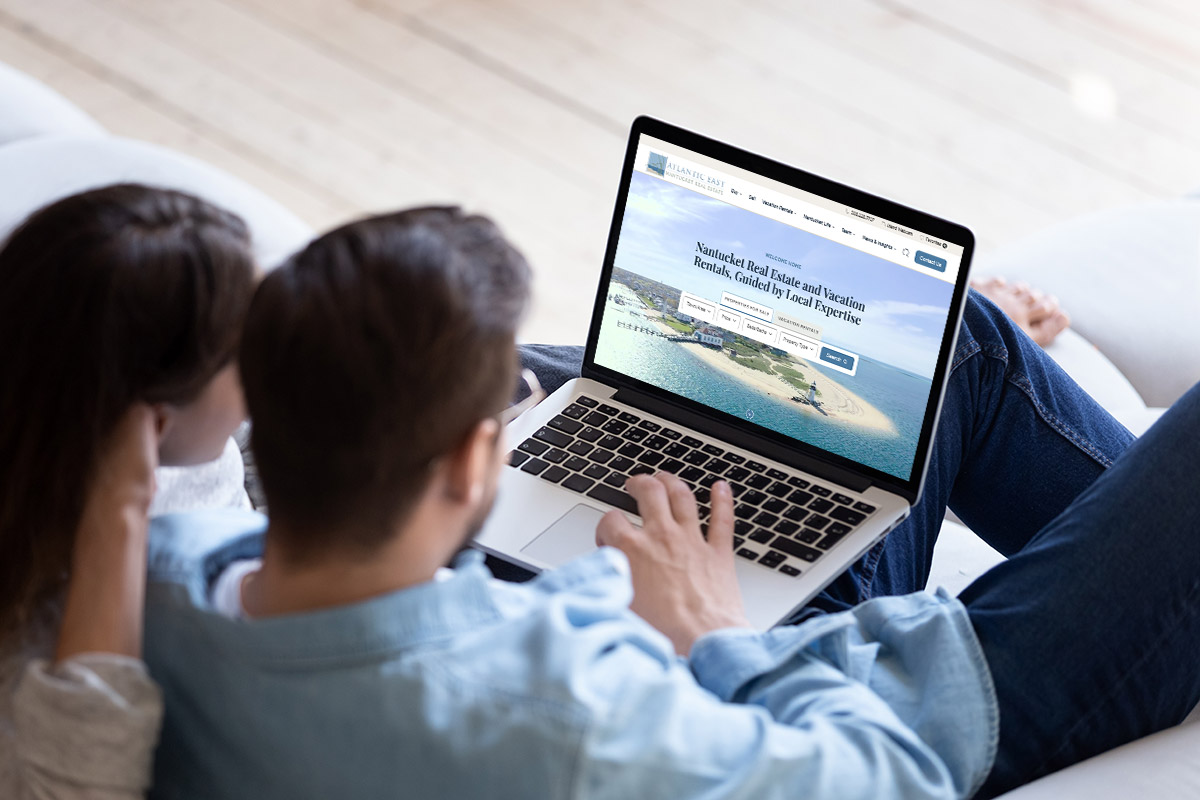
This perspective shaped our recent redesign for Atlantic East Nantucket Real Estate, and how to approach boutique real estate website UX.
Atlantic East is an independent Nantucket real estate brokerage made up of year-round island residents with decades of experience in the local market. Their clients include buyers, sellers, and vacation renters navigating a highly focused real estate market where local knowledge matters, from understanding the character of individual areas to navigating the regulations and nuances unique to Nantucket.
For the redesign, our goal was to pair that local expertise with a digital experience that felt equally knowledgeable, clear, and considered.
In the first five weeks after launch, sessions increased 23%, pageviews grew 31%, and form submissions increased 58%. Nantucket’s summer season certainly influences traffic, so we’re careful about attributing all of that growth to the redesign. More interestingly, the early data is already helping us identify where the experience can continue to improve, particularly on mobile.
When we began planning the project, one assumption about user entry points felt almost automatic.
The homepage search experience would work like the large real estate platforms most of us use every day. An open search field with autocomplete has become second nature on sites like Zillow and Realtor.com. Type a neighborhood, street, or town, and within a few seconds the system guides you to the right result.
It’s an excellent pattern when you’re searching across thousands of cities and millions of listings. If you’re buying anywhere in the country, “show me everything” makes perfect sense.
Nantucket is different.
The island is a much smaller market with clearly defined neighborhoods, property types, and buying patterns. After spending time with Atlantic East and understanding how their clients search, it became clear that visitors weren’t looking for an endless search box. They wanted a guided starting point. Much like if they were visiting a friend on the island…show me all the best spots to go!
Instead of asking users to think of the right keyword, we built a search experience around the questions they already had. Which area interests you? What’s your budget? How many bedrooms do you need? Are you looking for a vacation rental or a home to purchase?
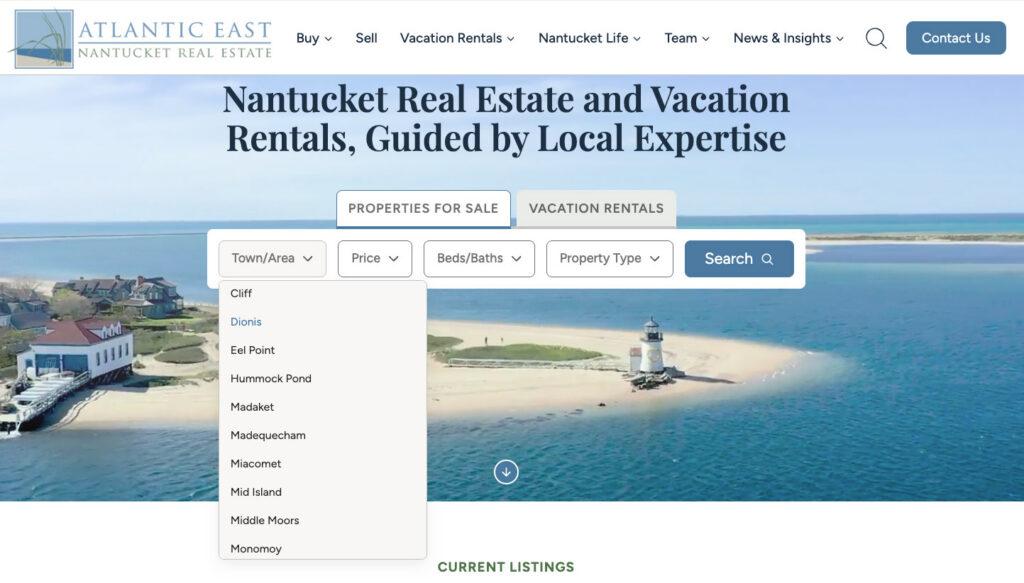
The experience became less about searching and more about helping people narrow their options from the very start.
We carried that same thinking into the navigation. Some users want to search immediately. Others prefer to browse available areas, property types, or resources before deciding where to go. Providing both paths lets people approach the site in the way that feels most natural to them.
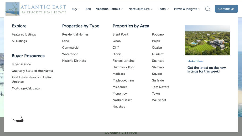
For boutique real estate and regional brokerages, this is an important distinction. The search tools that make sense for a national marketplace may introduce unnecessary complexity in a smaller market. Industry leaders are valuable sources of inspiration, but they shouldn’t become cookie-cutter templates for all sites. Every market has its own rhythm, and every audience deserves an experience designed around how they actually think.
One of the less glamorous parts of a website project, like a real estate website, happens long before the design is finished. It all starts with digging through the data.
Atlantic East’s listings come from LINK, an MLS shared by multiple agencies. We can’t control how every brokerage enters information into the MLS, but we can control how that information is interpreted and presented on the website.
As we reviewed the available fields, we noticed that some terminology didn’t match the language buyers naturally use. For example, LINK MLS classified a home as “1 Family.” While technically accurate, it isn’t how most people describe the type of home they’re looking for.
We mapped that data to “Single Family Residence” because it’s clearer and more familiar. There were other instances where we took a similar approach to ensure the terms being used by agents on the MLS side were terms that resonated with users on the website side. Similarly, some data fields you’d expect to be filled out consistently (like does this property have waterfront access) weren’t, and so we had to decide which fields we could reliably get certain types of information on a property so we could display that to a user.
While these seem like small decisions, this process is what ensures a consistent and predictable user experience. It’s also one that out-of-the-box plugins will miss or get incorrect because they have to make assumptions that the data is standardized and reliable.
One of the first things we do on every real estate project is review how MLS data maps into the website. It’s worth taking the time to understand what’s available, how consistently it’s used, and whether the terminology matches what your audience expects to see. If you’re using a plugin, many times you’re able to change the terms that display to the user so you aren’t just repeating what’s in the MLS. However, not all may allow for the ability to map an MLS data field to your data field within your website. It’s worth checking with the plugin provider to see what’s possible.
Below is a sample of what our initial mapping looked like for Vacation Rentals using the Barefoot API.
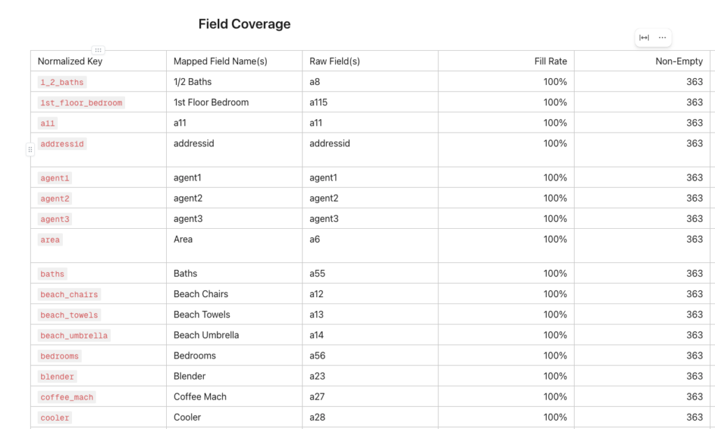
We approached the property search filters in a similar way. Rather than presenting every possible option available in the database, we focused on the criteria that were both meaningful to buyers and renters and consistently populated in the listing data. We then ensured that the terms we used were ones that resonated with our users.
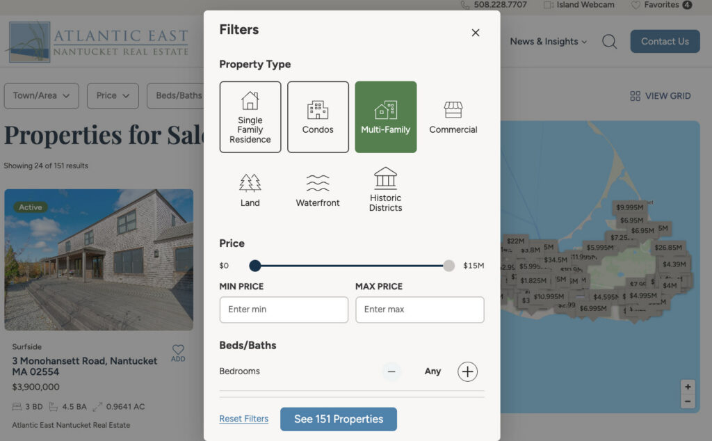
Reliable filters build confidence because visitors know they’ll receive results they can trust. Think of all the times you’ve tried to apply multiple filters on a website and ended up with mixed or confusing results. Your trust in that site erodes very quickly.
One conversation we revisited several times as a team centered on the Favorites feature.
Atlantic East’s previous website combined saving a property with the process of requesting information about that property. We saw those as two very different moments in the customer journey and thought it important to separate them.
Someone browsing properties is often comparing possibilities. Saving a home or vacation rental is similar to placing an item in a shopping cart. It gives them space to reflect before making a decision.
Someone viewing a property in detail is often ready to take the next step and start a conversation.
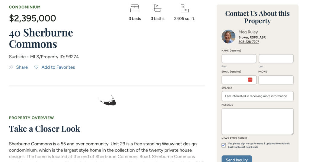
That’s why every property page (sale or vacation rental) includes a prominent inquiry form that remains stuck to the sidebar while scrolling on desktop. On mobile, the form is prominent and easy to use. Visitors who know they’ve found the right property can reach out immediately.
For those who are still exploring, they can use the Favorites feature to build a list of favorites without interrupting that experience. When the user is ready, they can email Atlantic East their full list of properties they are interested in.
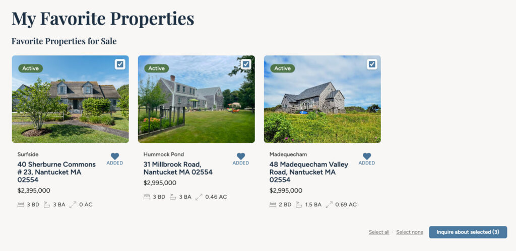
Creating a good user experience often comes down to recognizing user intent. People arrive at different stages of their journey, and a website should support each stage rather than trying to move everyone through the same path.
There are parts of a website that almost disappear when they’re done well (and when they aren’t done well, are painfully obvious), and color is one of them.
We spend a surprising amount of time refining palettes, adjusting neutral tones, and deciding which colors should communicate action. Visitors may never consciously notice those decisions, but they learn them as they move through the site.
When we set up our mockups, we assign colors to functions so it’s clear how they can be used. We typically use the logo as the starting point if the client doesn’t have an established brand guide. We then determine what vibe we want the site to have, which will ultimately determine how we apply the color palette. For Atlantic East, we wanted the site to feel like you’re walking the streets and shores of Nantucket: think dune grass, weathered-gray shingles, and pristine sandy coastlines.
That gave us the atmosphere of the site, but we also needed color to perform a job.
Buttons, links, calls to action, and other interactive elements need enough consistency that people quickly understand what is clickable and what will happen next.
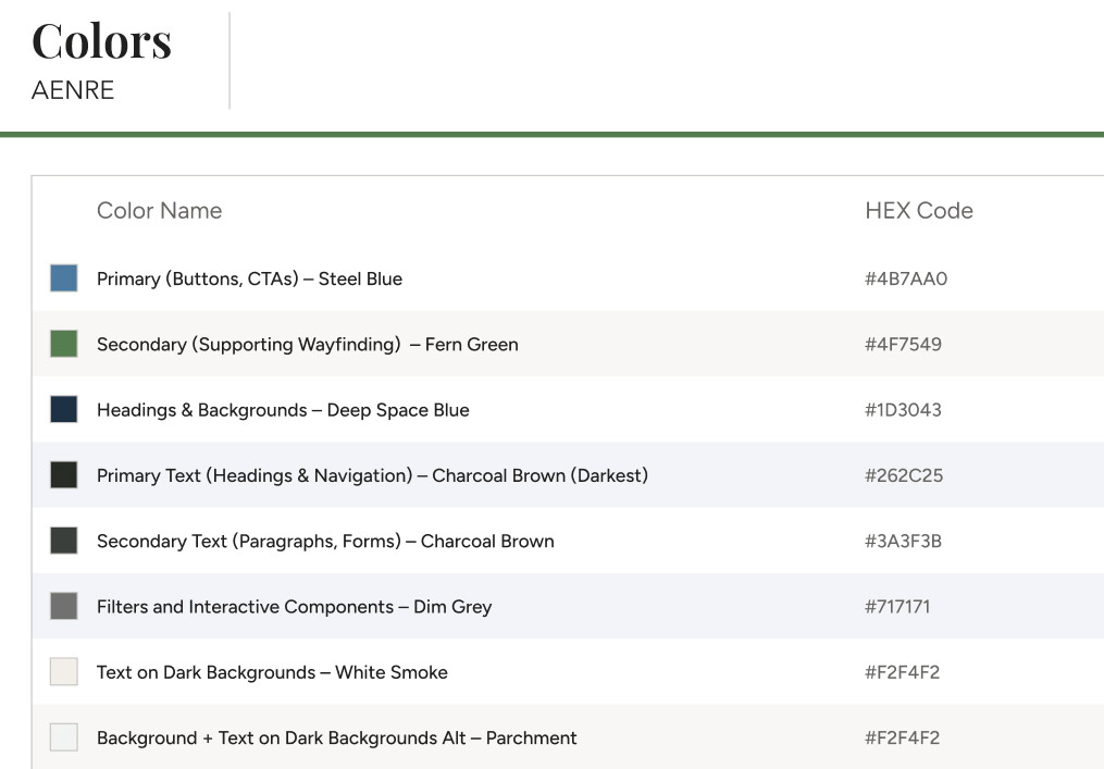
It can be easy to think of color as the finishing touch. (Okay, let’s now figure out what color to paint the walls now that the room is built.) I see color being just as important a decision to make early on in the build process as choosing the right set of plugins. Color is about communication. It sets the tone for the experience and ensures that users easily understand what to expect from the website, what actions to take, and what will come next.
One of my favorite moments from the project came after the overall design direction had already been established.
For the closing call-to-action that appears throughout the website, I chose a photograph featuring one of Nantucket’s lighthouses. The accompanying message invited visitors to take the next step in finding the right home or planning their stay.
The image felt appropriate because lighthouses have always represented guidance: their function is to literally help people find their way.

When the client later told me it was her favorite image on the website, that was one of those moments where I felt we had gotten it right. The intention behind the choice had translated.
There’s still an important human layer to website design. Sometimes it comes down to spending the extra time to find the image, phrase, or detail that makes the entire experience feel more considered.
One of the advantages of launching a new website is that it immediately starts teaching you something new about the people using it.
The research and planning we do before launch gives us a strong foundation, but once real users begin interacting with the site, we can see how those decisions hold up. Where are people spending their time? Which paths are they following? What actions are they taking? And where might the experience still be creating friction?
For Atlantic East, the early data has already given us areas to watch. Desktop engagement improved following launch, while mobile engagement has been slower to follow. That gives us something specific to investigate as we continue evaluating the site rather than making assumptions about what needs to change.
This is an important part of our process because a website shouldn’t be viewed as a finished product. The decisions we make during a redesign give us a starting point. Real user behavior helps us understand where to go next.
The Atlantic East project reinforced something that sounds obvious until you start looking at how many websites within the same industry follow nearly identical formulas.
Good real estate website UX shares common ingredients. People need to search properties, understand listings, save options, learn about the market, and contact someone when they’re ready.
The way those pieces come together should reflect the audience using them.
A person searching millions of listings across the country has different needs from someone deciding between a handful of distinct areas on Nantucket. A vacation renter browsing ideas has different needs from a buyer ready to schedule a showing.
Understanding those differences is where intentional design begins.
Whether someone is choosing a home they may own for decades or planning a week away with their family, there’s emotion behind the screen. The more we understand the decisions they’re trying to make, the better we can design an experience that helps them move forward.
Check out our case study on Atlantic East.