

Learning to snowboard in my late 20s, my first successfully navigated blue square trail was at Smugglers’ Notch Resort, Vermont. Conditions were perfect, I was among family, and I made it down with all smiles and zero falls—a memory that would stick with me forever. Let’s just say this was the start of many memorable “firsts” for me at Smuggs.
Happily, I can add a new line item to my list of Smuggs’ firsts: the first website redesign for a company where I am an actual end-user. Navigating Smugglers’ Notch Resort is like exploring their new website—both offer an immersive, exciting experience. Just as my first snowboard run on the Waterfall trail was memorable and filled with discovery, working on the Smuggs website redesign has been a thrilling journey. From the spacious trails that offer freedom and adventure to the user-friendly design of the new site, both paths are crafted to ensure ease and enjoyment. The final product is an online experience as dynamic and welcoming as the resort itself.
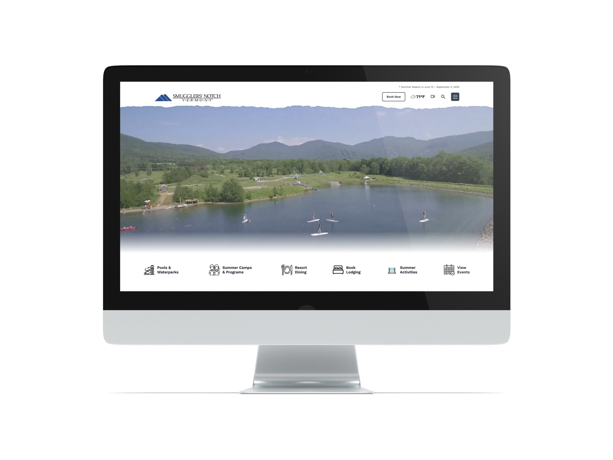
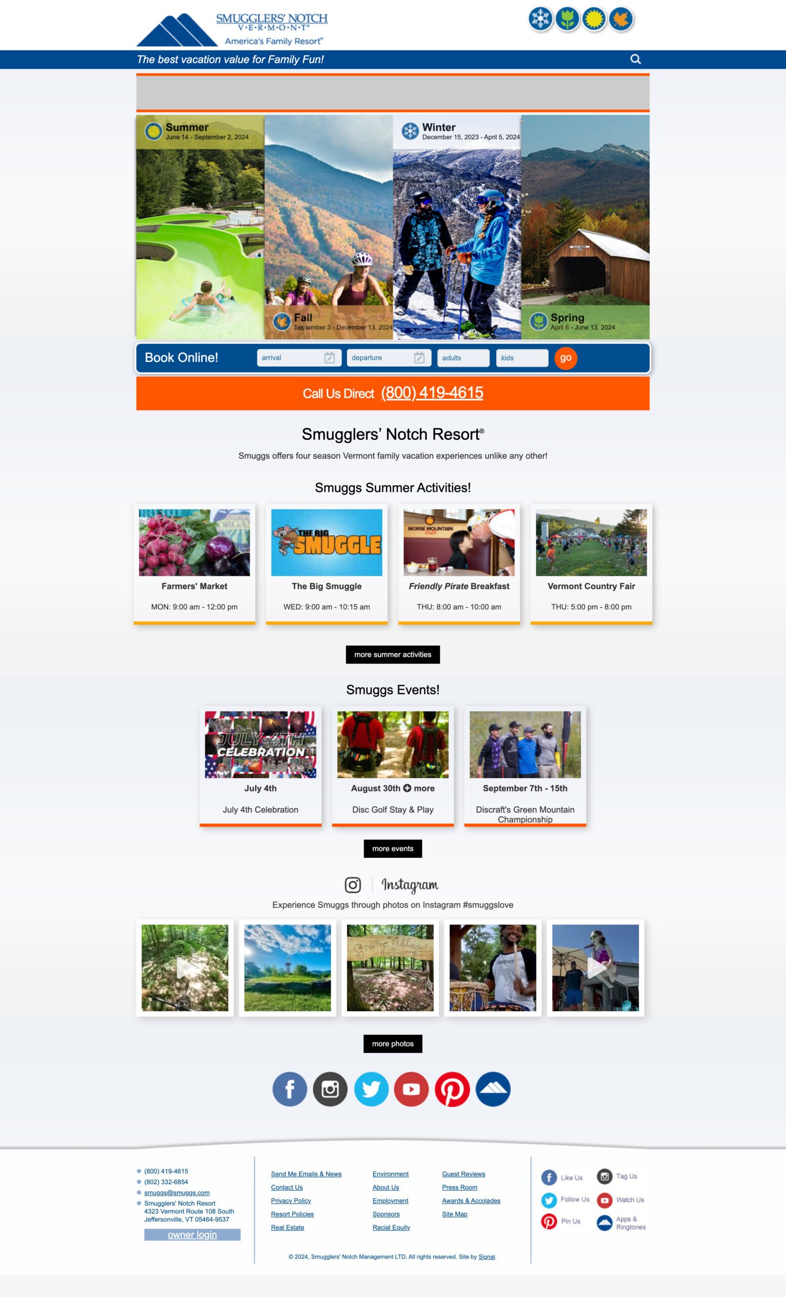
Smugglers’ Notch Resort spans three mountains: Morse, Madonna, and Sterling as part of the Long Trail in the Green Mountain Range of Vermont. It’s an absolutely beautiful location, a place that is perfect for a family vacation, any season of the year. We wanted the new website to feel like you were right at Smuggs, immersed in the landscape and among family & friends. Large, expansive sections of content, compelling video, and visually engaging photography—those were absolute must-haves.
The website also serves as the hub for all information related to the resort. Access to timely and relevant details like upcoming events, weather conditions, promotions, and resort activities in as few clicks as possible would be essential to its success.
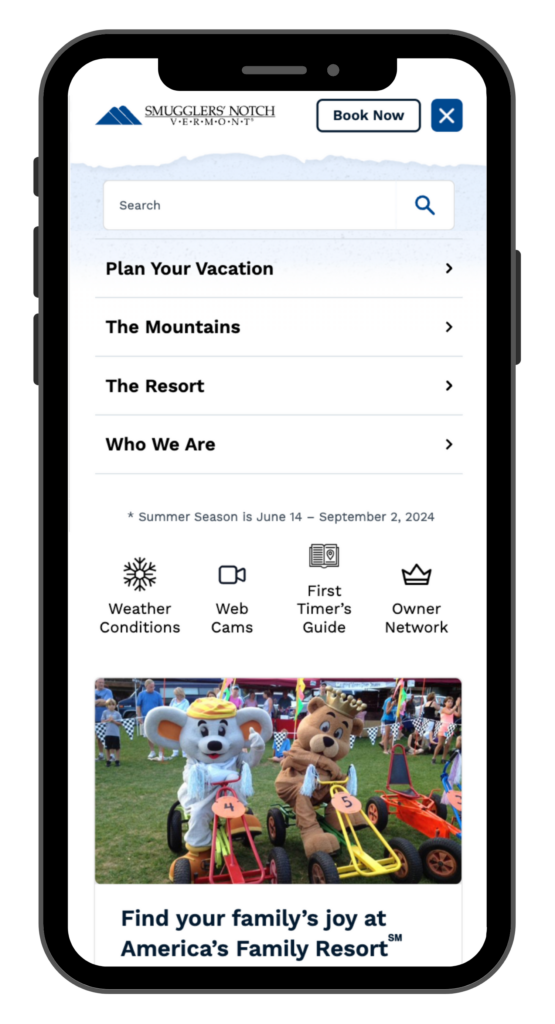
More than 50% of the visitors to the Smuggs website are on mobile devices. We knew we had to build for these users first and make sure that everything a person needed was right at their fingertips. Visitors to Smuggs may be there on vacation or they may be locals looking to spend the day on the slopes or at the waterpark. Placement for information like real-time weather data and conditions/trail reports has to be predictable and accessible within just a few clicks.
In the mobile menu, we use icons to call attention to common pages like a Conditions Report, Webcams, and the Property Owner’s Portal. On the homepage above the fold, we provide a scrollable bar of quick links for users to purchase lift tickets, book lodging, and view the day’s events.
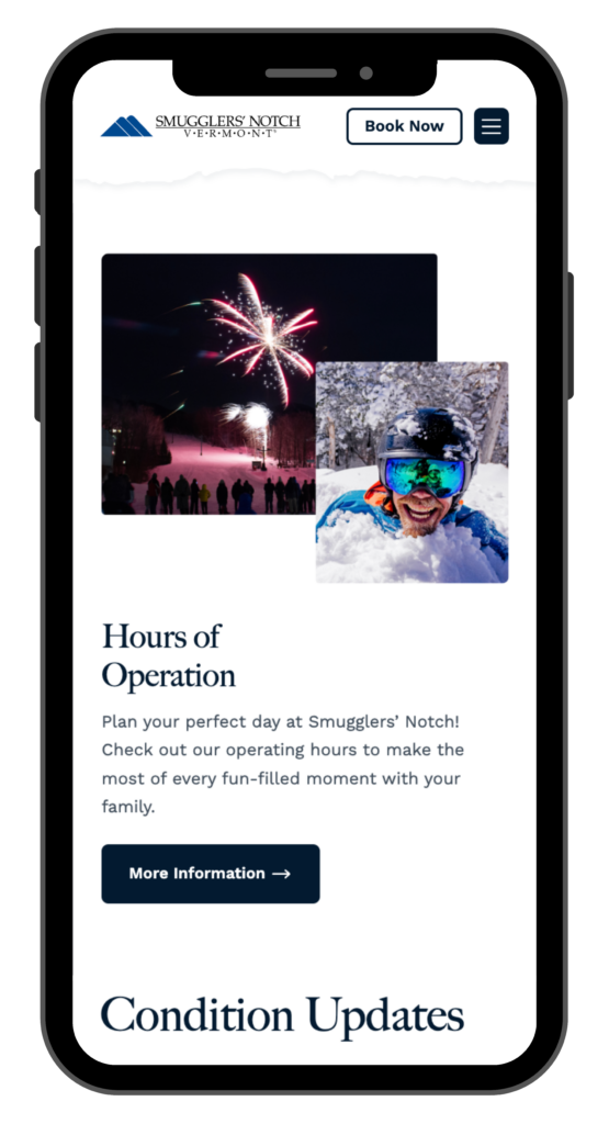
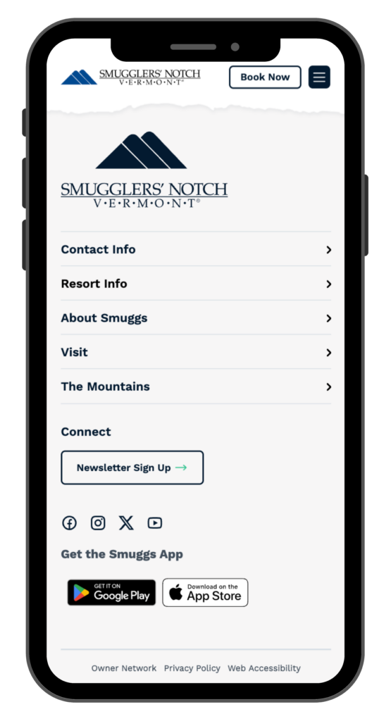
Information throughout the site is tidy and condensed, helping to reduce the scroll on long pages and to give the user the ability to focus on one section of content at a time. The footer leverages accordions to group and condense content so that it includes additional navigation to key pages without feeling visually overwhelming.
The perfectly curated photography presented in an expansive, immersive manner is sure to make you feel you’re right in the Green Mountains taking in a sunset on a warm summer’s evening or crushing powder on a snow day in February. The site incorporates large, stunning photography throughout the site and includes aerial video showcasing the beauty of Vermont across all four seasons.
Since Smuggs is an absolute delight to visit, we wanted the new website to feel like an extension of the on-location Smuggs experience. We included little visual “delighters” to help create engagement and offer little “Ooo, that’s fun” comments as a user browses the site. There are animated icons, embedded video, and hover effects sprinkled throughout the site to echo the feeling of stumbling across the perfect glades on skis, sipping a refreshing beverage poolside, or hiking to the top of Sterling to view the sunset.
There is also a subtle color shift to certain elements of the site, like buttons and hover states, when the season changes at Smuggs. It’s a small way to echo the color palette of the landscape and experience a user will encounter when visiting the resort at different times of the year.
Smuggs is a four-season resort with a range of activities and events happening throughout the year that need to be visible and accessible on the website. The admin required a User Interface (UI) that allows them to quickly edit pages, add new events, manage ongoing promotions, and update reports like weather conditions, lift and trail statuses, and daily messages. We also built a custom UI for the client to enter trail data like status, rating, conditions, and comments in one single location of the site for ease of management.
WordPress is such an easy-to-use Content Management System that it was the obvious platform for a brochure site like Smuggs. We use Gutenberg as the page editor of choice because 1) Gutenberg is bundled in WordPress core so updates to Gutenberg happen when updates to WordPress core happens and 2) it’s an easy-to-use interface that allows a non-developer the ability to creatively layout pages. We then create reusable block patterns that the client can use to build out their pages and tailor them to the content they have available, not to try and shoehorn their content into the design.
The new Smuggs website feels like an extension of the Smuggs resort experience. It’s welcoming, inviting, energetic, fun, and expansive. Most importantly, the feeling of family, one of their core pillars, is embedded throughout whether it’s being communicated via carefully curated photographs, friendly messaging, or the thoughtful presentation of resort activities and amenities. Browsing through the website, it’s easy to feel like Smuggs is not only a place you’d like to visit, but one where you can feel right at home.

I don’t think there was a single member of our Engineering Team who didn’t contribute to the buildout of the new Smuggs website in some form or fashion. To use the cliche phrase “It takes a village. . .”, it really did require immense collaboration from our team and the Smuggs team to take the vision for the new site and turn it into a reality. We honestly couldn’t be happier with the results, and, for me, being the one who helped create the overall vision for the new site, I couldn’t be more proud of the teams’ hard work in executing that vision.