

Having a background in photography, I always get excited when clients come to us with an extensive media library of images we can use in a website redesign. Great photography adds that extra sheen to a website, creating more engagement and helping a user better relate to your brand.
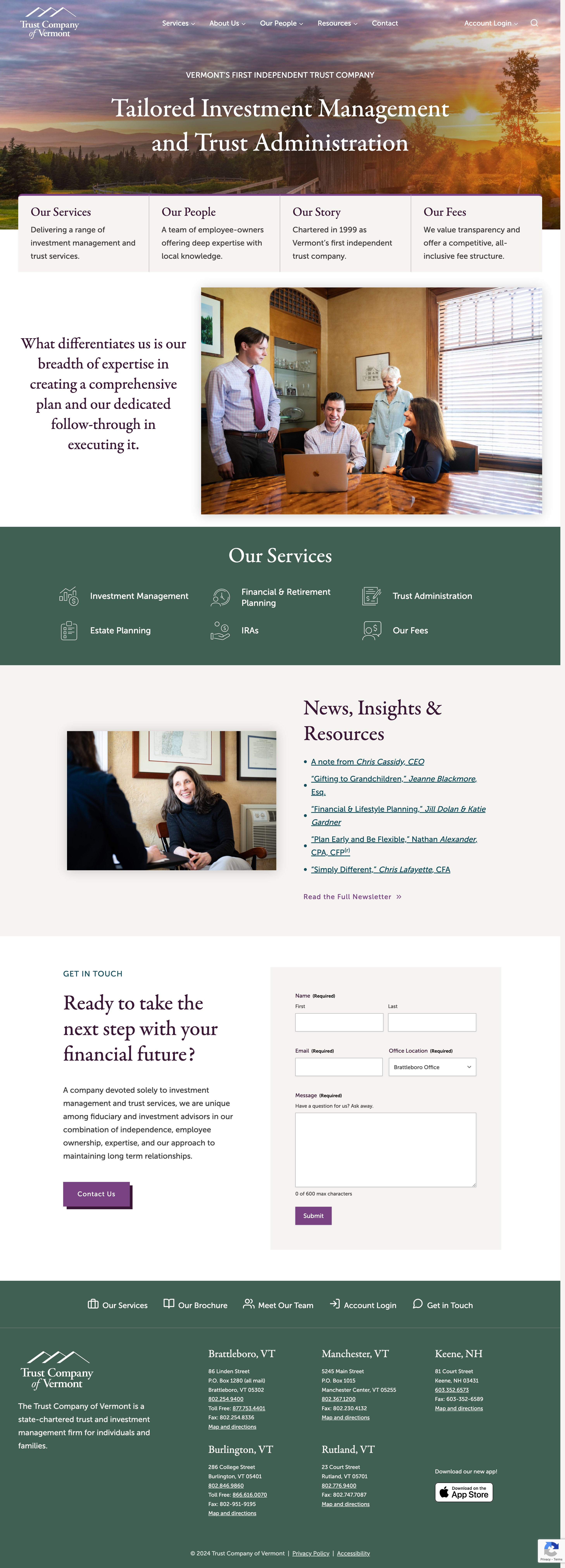
This was the case in our recent launch of the new Trust Company of Vermont (TCV) website. The client worked with a local photographer to take pictures of their staff at each of their different office locations over the years. The resulting images paint such a beautiful, in-depth portrait of the people who work at TCV that as you navigate through the site, you get a real sense of the team and what it will be like to work with them.
A little bit about TCV as described on their new website:
The Trust Company of Vermont is an employee-owned, locally controlled trust and investment management firm serving individuals and families. Headquartered in Brattleboro, with offices in Burlington, Rutland, Manchester, and Keene, NH, the Trust Company was chartered in 1999 and became the state’s first independent trust company.
When TCV came to us for a redesign, the one item they liked about their old site was the use of the professional photos that had been taken of their team. Incorporating these photos onto the site was a key requirement of the redesign, along with a few other items:
Dedicated service pages to better highlight all TCV can do for a client was a top priority for this build. Bonus! This is ideal for SEO as well. In order to rank for a search term, a page on your website must exist for that term.
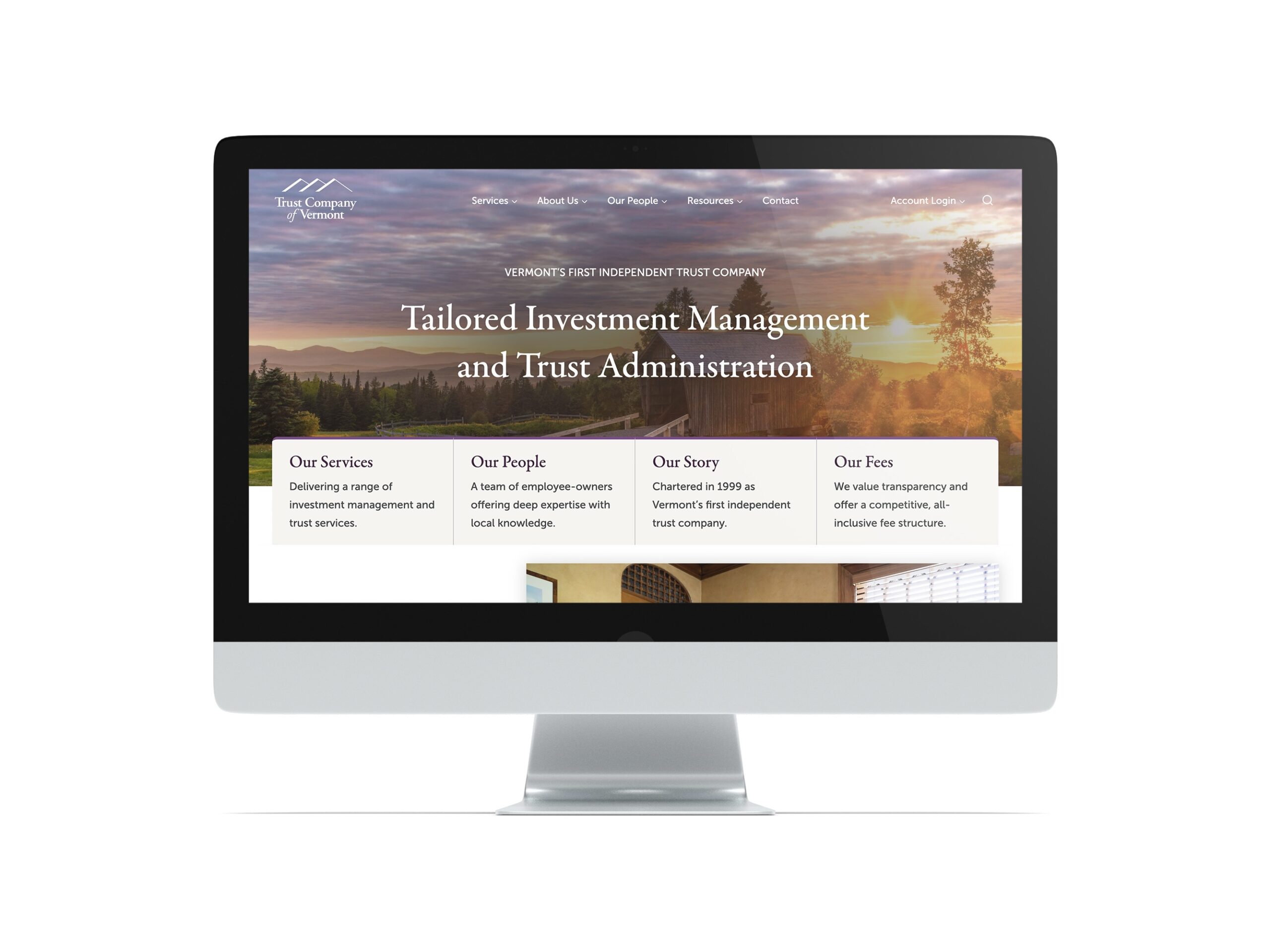
The new TCV website was in desperate need of a fresh, modern look and feel. What does this translate to? When I hear this request, I immediately think of spacing (both horizontal and vertical), varied content layout, and typography.
Open up the page! For desktop, use both vertical space and horizontal space. We don’t need to be restricted to a narrow area of content anymore. Break free of containers! On mobile, a user can scroll, no problem. Accordions can also tidy up and condense information on mobile so it’s easier for a user to digest.
For sites where we have to organize and display a lot of text, we like making it so that each section is visually distinct from the one above it. Ways to do this would be adjusting the background colors of each section to delineate the start and stop of a topic, using rows and columns to break up text into smaller chunks so it’s easier to read, and allowing for a brief visual pause to reduce scroll fatigue (think of a pull quote or a block quote that provides a summary of a section or highlights a compelling statement).
Leverage fonts as design elements and let them help communicate the type of brand you are. For the TCV site, we chose a classic-looking and elegant serif font, instilling a sense of professionalism and trust. We paired this with a highly legible and friendly-looking sans-serif font, which evokes a welcoming and warm vibe.
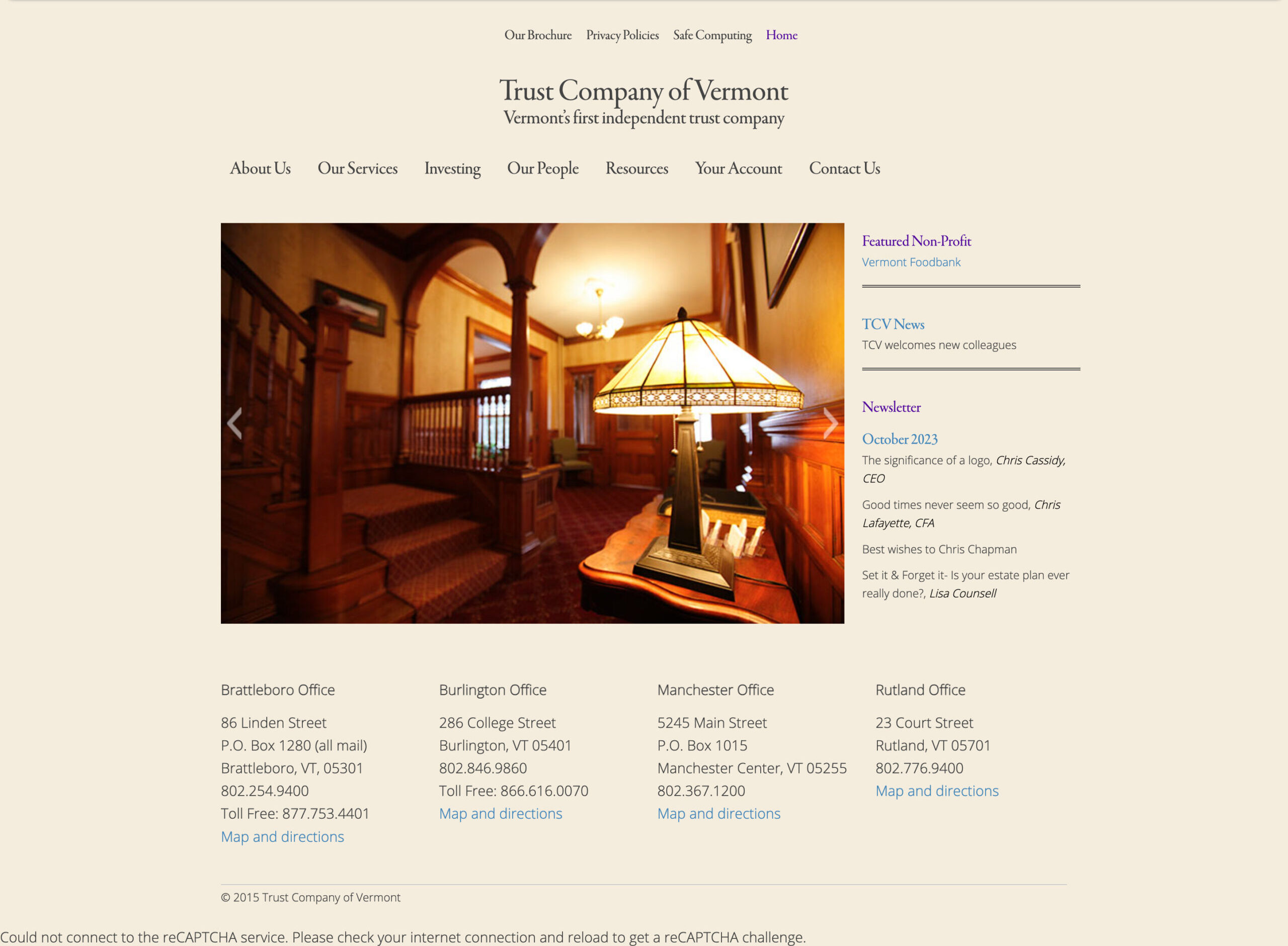
Before the redesign, the client would publish their newsletter in a PDF format and then link to it from the website. This certainly works well if you’d like to have the newsletter look a specific way and if your users appreciate the ability to print out a hard copy of the newsletter. The downside to this is your newsletter isn’t searchable on your WordPress website nor is it searchable by Google.
Additionally, every time you want to publish a new article, you have to manually add it to a page rather than leverage WordPress’s native functionality of dynamically posting content. The client still incorporates their newsletter as a PDF for those who prefer that format and they are adding the newsletter content to their site in the form of blog posts so users can search for topics if they like. Win-win!
The result is a website that feels like you just walked through the doors of one of their historic office buildings. Personality and history are thoughtfully preserved and proudly on display and as you walk through the halls (erm, navigate the site), you get a sense of the trustworthiness and support of a long-standing foundation.
