Case Study
Eames Office
An iconic American design company and retailer of home goods, art, and more.
Charles and Ray Eames are American design icons. The couple started Eames Office in 1941 from a Los Angeles apartment just a few months after getting married in Chicago. Following the success of early creations during World War II, the two went on to design iconic mid-century furniture, such as the Eames Lounge Chair. Their contributions to architecture, furniture design, industrial design, manufacturing, and photographic arts remain culturally significant and influential today.
Project Details
- TECHNOLOGIES USED
- WordPress
- WooCommerce
- Sage (ERP)
- ShipStation
- PayPal
- Apple Pay
- Gravity Forms Plugin
- Google Analytics
- KEY HIGHLIGHTS
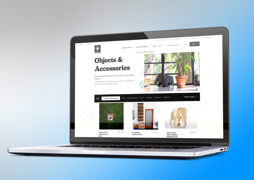
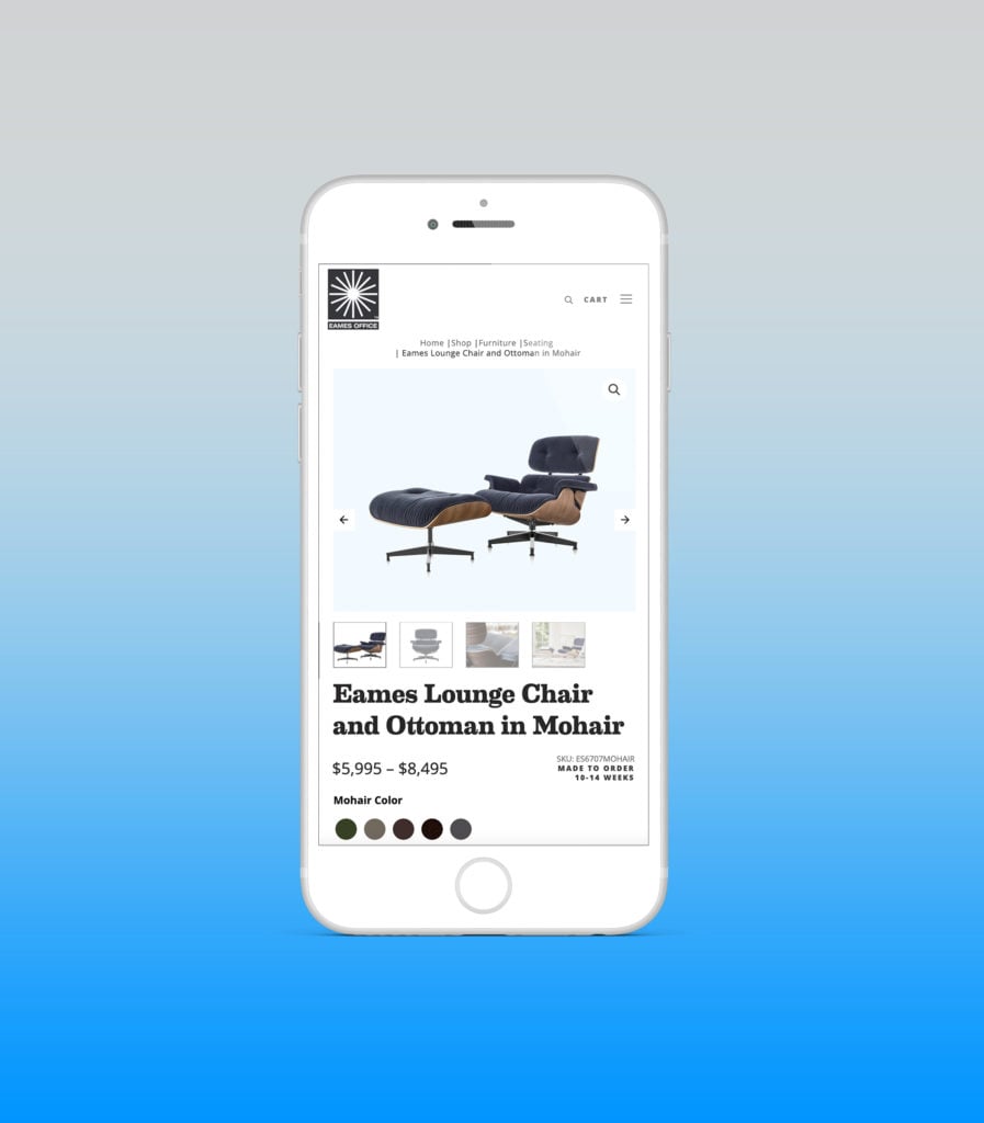
- Merging of two separate WordPress and Magento websites into one for a more streamlined user experience
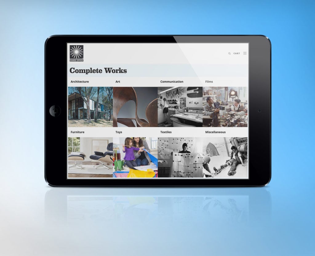
- Artistic and modern design reflective of the iconic Eames Office brand
- Large increases in sessions, transactions, and revenue as a result of Google Ads management
Google Ads Management
Before redesigning the website, Eames initially came to us for website hosting and Google Ads eCommerce management, specifically Shopping and Search campaigns. Though our team was able to drive effective results, it was apparent that Eames would benefit from a new website with enhanced product data. This in turn would better optimize the delivery of their products on Google Ads. After 6 months of our Google Ads management services, they decided to move forward with the redesign. As a result, we’ve seen some incredible increases in site traffic, transactions, and revenue.
Eames Office’s Google Ads Campaigns Account For
of Total Site Visitors
of Total Site Sessions
of Total Revenue
of Total Transactions
Website Design
The Challenge
The iconic Eames Office has been a design staple in the United States for decades, which is why they wanted their new website to reflect this with a bold and modern design. We were thrilled to have been selected to take on this challenge and prove we’re not only the best technical agency around, but undeniably creative as well.
Before redesigning their website with Bytes.co, Eames had two separate websites: one on WordPress and one on Magento. In addition to a refreshed design, we also had to decide whether or not to merge the two websites into one, as well as how to best improve user experience.
Our Approach
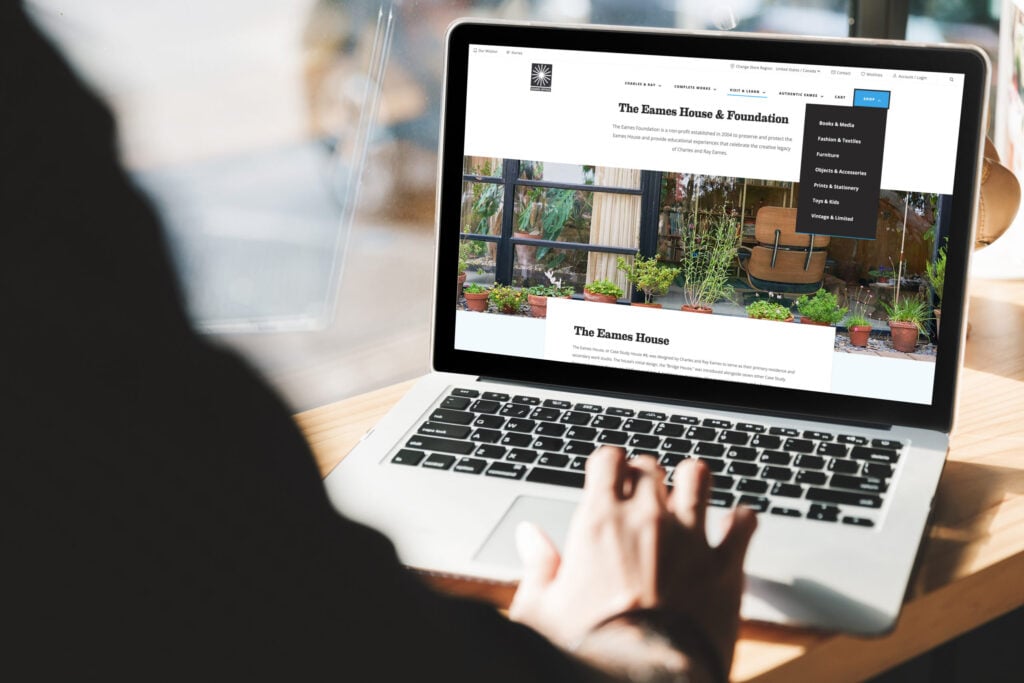
We decided that the best approach to this project would be to merge the two websites, rather than keep them separate. We chose to keep the website on WordPress and add WooCommerce for the eCommerce portion of the site. This not only delivers a superior user experience, but greatly improves Eames’ SEO. Once the decision was made to combine the two websites, the way in which we restructured the navigation and content became extremely important.
Ensuring users could navigate through the website and find the information and products they were looking for efficiently was essential. Furthermore, we ensured that the new website was built to meet WCAG 2.1 Level AA accessibility standards, thus making it accessible to everyone and assuring a more scalable, long-lasting website.

Homepage Layout & Design
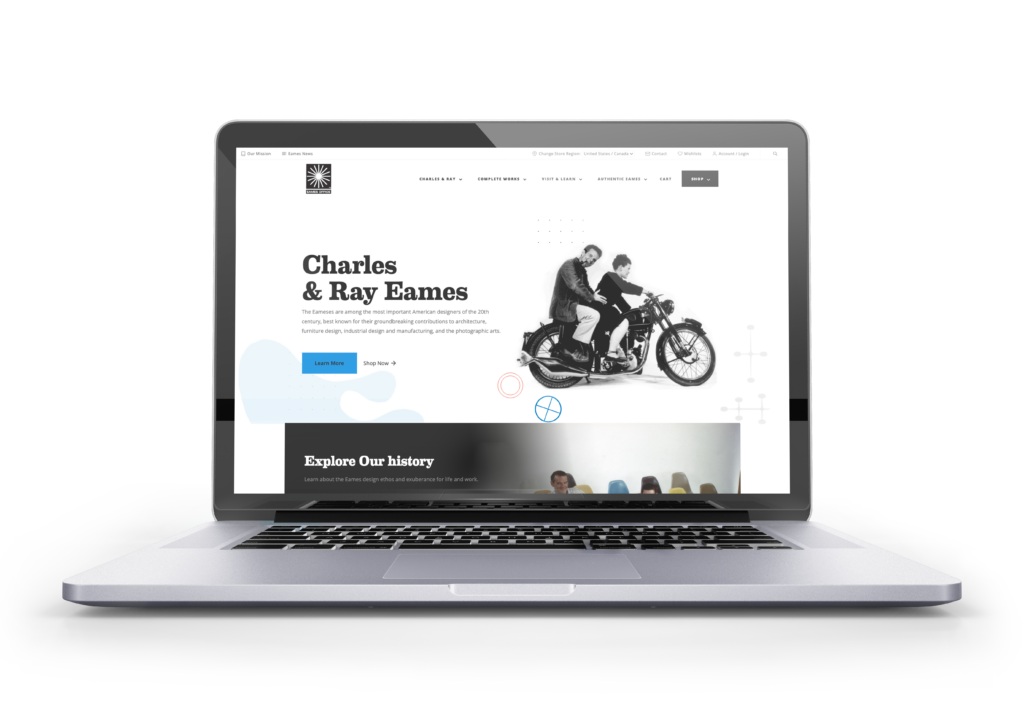
Simultaneously provides users with a museum-style experience of the Eames Office brand as well as the ability to shop their iconic products.
- Mega Menu
- Company History Highlight
- Product & Category Breakdowns
- Featured Products Section
