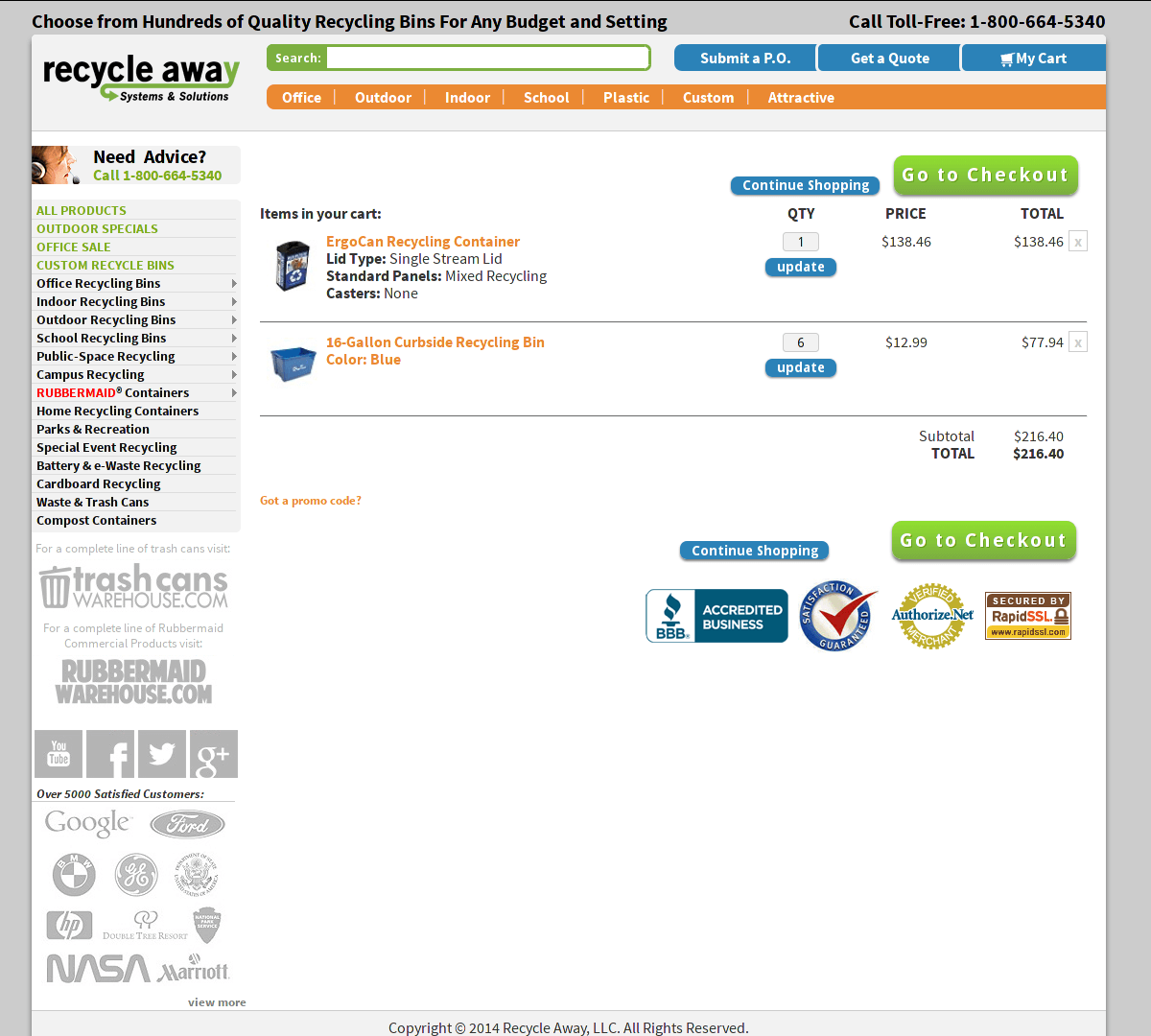
We recently received a call from a client who wanted to clean up their site and streamline their checkout process. As evident from the screenshots below, you can see there were definite improvements to be made.
Tasked with doing “whatever it takes” to make this checkout flow both look good and be simple for the user, I found my trusty machete (named Mack) and got to work. Note: The screenshots for the “original” version were taken after we’d already done some work on the header and sidebar area for this client.
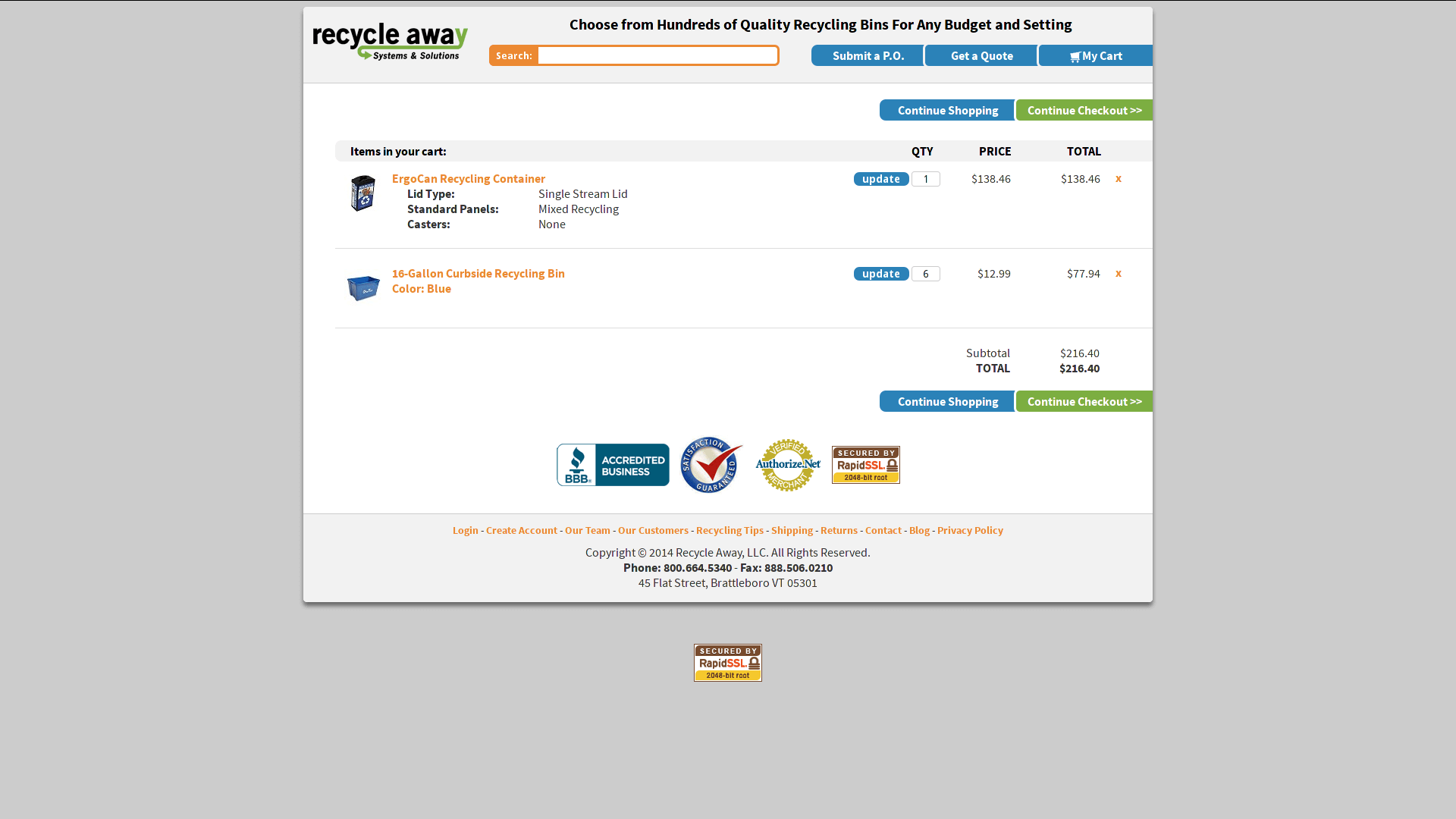
The name of the game for this project was focus. Like a horse pulling a buggy in the city, we needed users to stay on target and pull through to the end of the checkout process. Any distractions, loud noises, or tasty street food had to be removed.
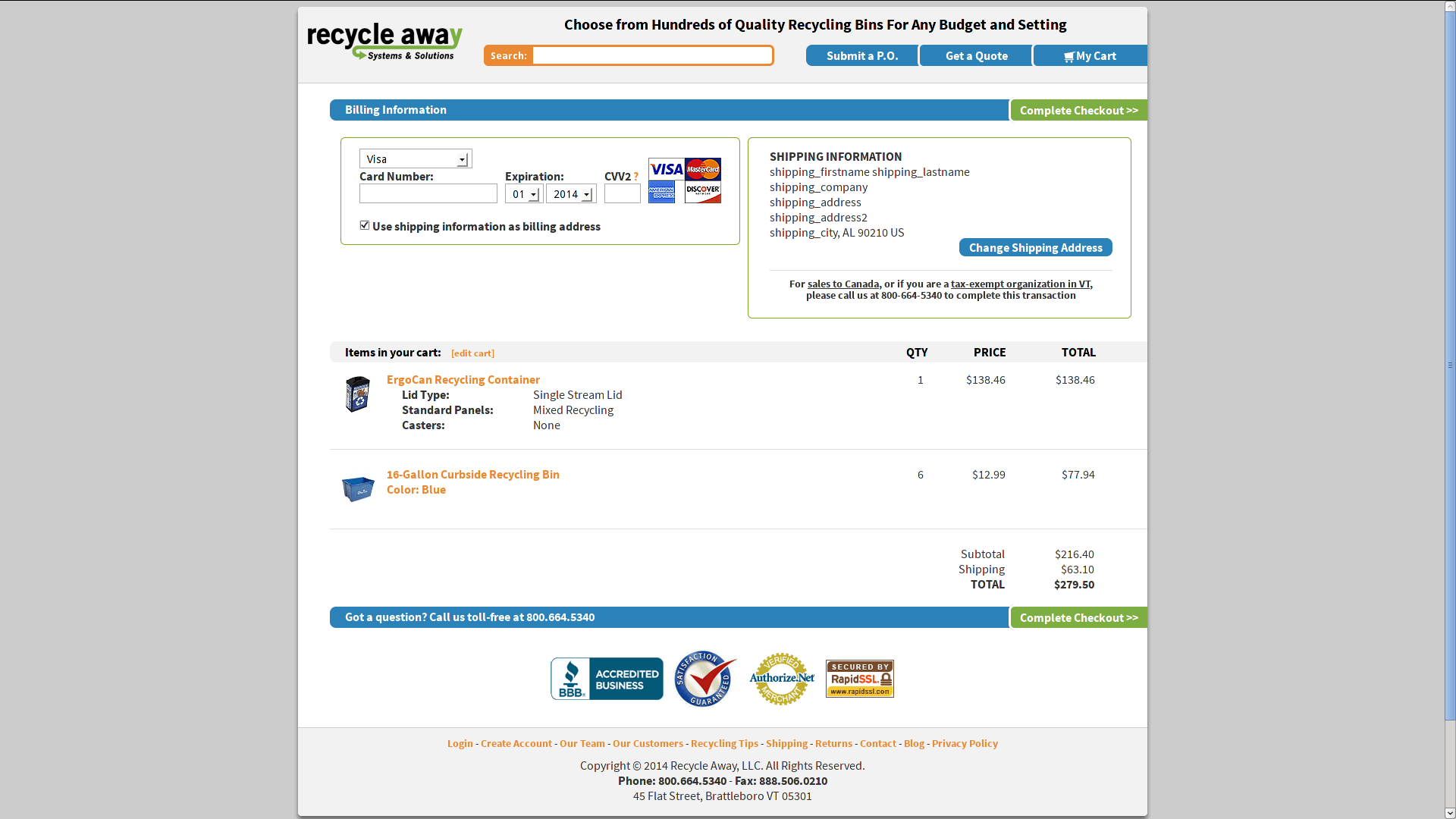
As it turned out, removing the sidebar was a very simple chore and not only reclaimed some precious screen space on this not-yet-responsive site, but also cleared out about half the links on the page. Luck had it that it also removed a whole slew of jumbled graphics. None of that noise helped the user get through the checkout process, so it was destined for the trash.
Simple organization and alignment were all that remained. Again, deciding where to begin was in some ways the hardest part.
I would not call myself a web designer by trade, but I have worked alongside many for years. One concept I’ve picked up from them that resonates with me is that graphic design is just another form of language. The placement of items on the page is your syntax, the space between them is your grammar, and the colors are your font. The metaphor is necessarily vague, but it helps me get where we need to be and understand the task better. With this in mind, I took a hard look at the options a user had when looking at any of the cart pages.
First of all, the buttons available on the cart pages of RecycleAway.com (“Continue to Checkout”, as well as “Continue Shopping”) needed to be the same size because the buttons are peers, and carry equal importance in the checkout process. However, they serve very different purposes, hence different colors. The “Continue to Checkout” button is green for all the reasons you’d expect – We want the user to continue on and complete the order. Likewise, we’d prefer less emphasis on the “Continue Shopping” button at this point, so I chose a color from the existing palette that blends in more than the green.
The cart emblems from the BBB and RapidSSL are nice, feel-good items that lend a certain air of legitimacy, so I placed them by the checkout buttons where users might be looking for them. Nobody (we hope) is going to cancel a sale because they’re not there, but they might make the sale a little quicker because they are. Here is where I had to tell Mack the machete to relax – The emblems and accolades need to stay, but I moved them a little further from our buttons.
Mack was able carve out the photo of our customer rep from cart – She was nice and all, but, again, not necessary to the checkout process.
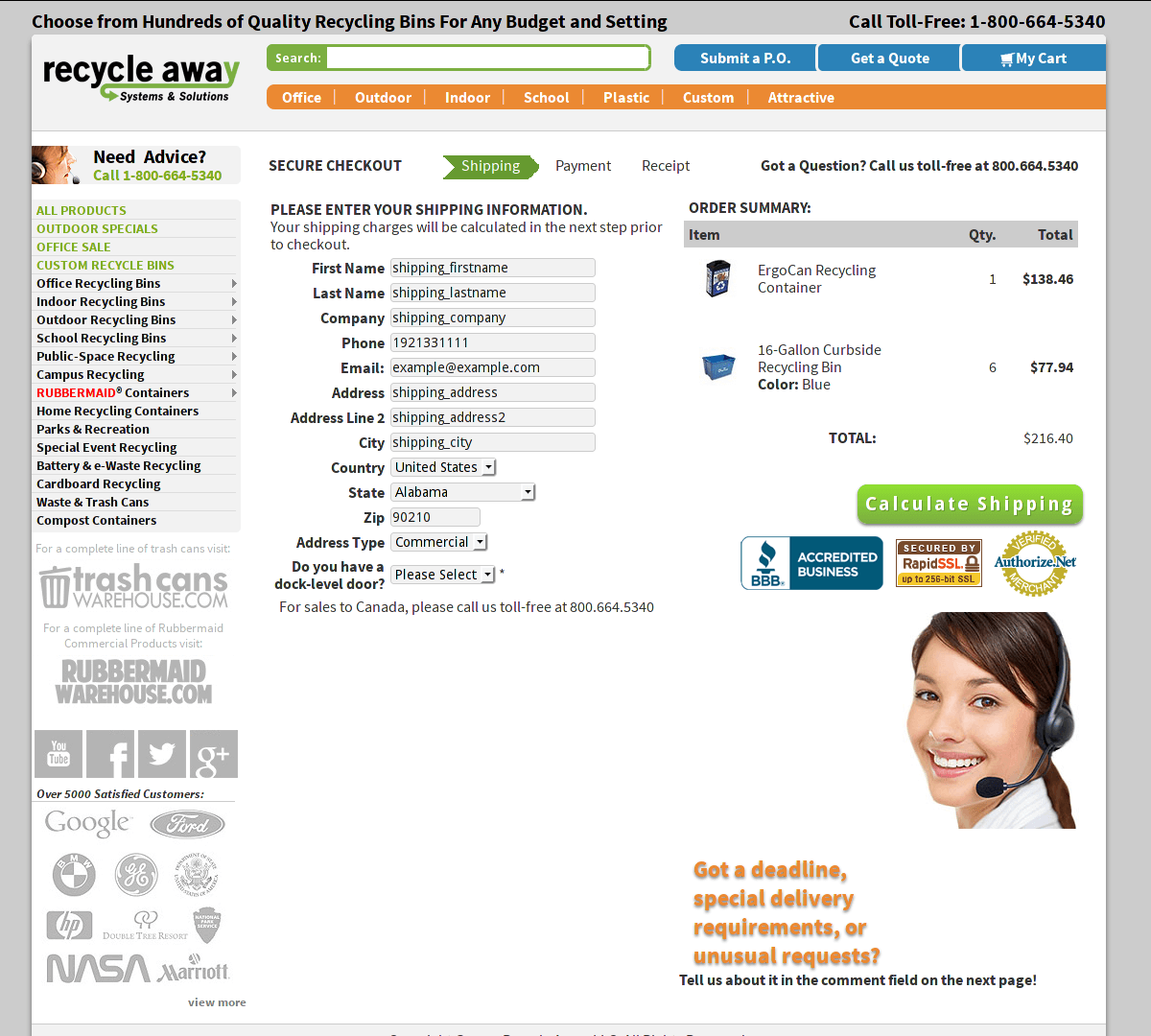
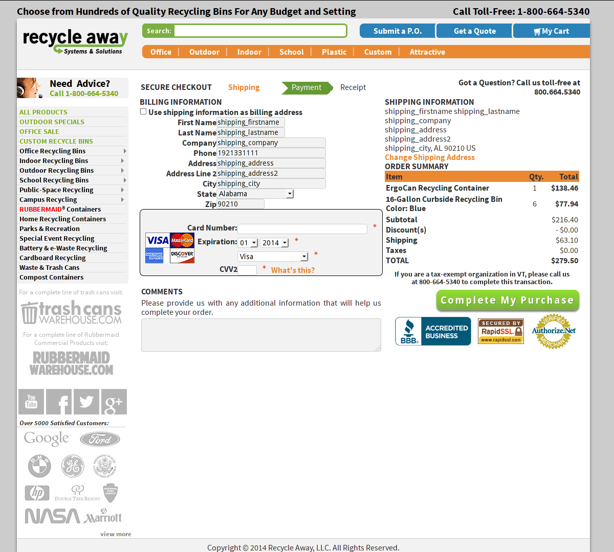
It was also very important to me that when users hit “Continue to Checkout,” to go from one page to the next, that that button bar appeared to stay fixed in place. This helps the process, as the user is already familiar with the placement of key elements to the page.
Overall, the biggest challenge in this project was making sure that each page of the process looked like the page before it, that everything on the page was carefully placed and had a specific purpose, and that the user was able to focus on the most important steps of the process. I enjoyed the challenges in making this checkout process better and both myself and the client are excited to see the positive results.