I will do my best to temper the number of cutesy puns I use as I write this post about one of our recently launched websites. I will admit, it’s going to be challenging due to the subject matter and how pawsitively excited I am about announcing this new website (see, I’m already up to two…).
We’ve been working with Animal Welfare Society (AWS) for several years when they came to us with an RFP for a website redesign. We jumped right on the opportunity—AWS has been a long-standing client who has been delightful to work with these past years and we believe in their mission. We love it when we can build a website that has an impact on so many lives, four-footed ones included!
Before we dive into the details, let’s talk about the heart and soul behind the Animal Welfare Society.
Animal Welfare Society exists to serve as the safety net for lost and homeless pets and to provide access to affordable services and resources necessary for long term well-being, so pets and their families stay together and thrive.
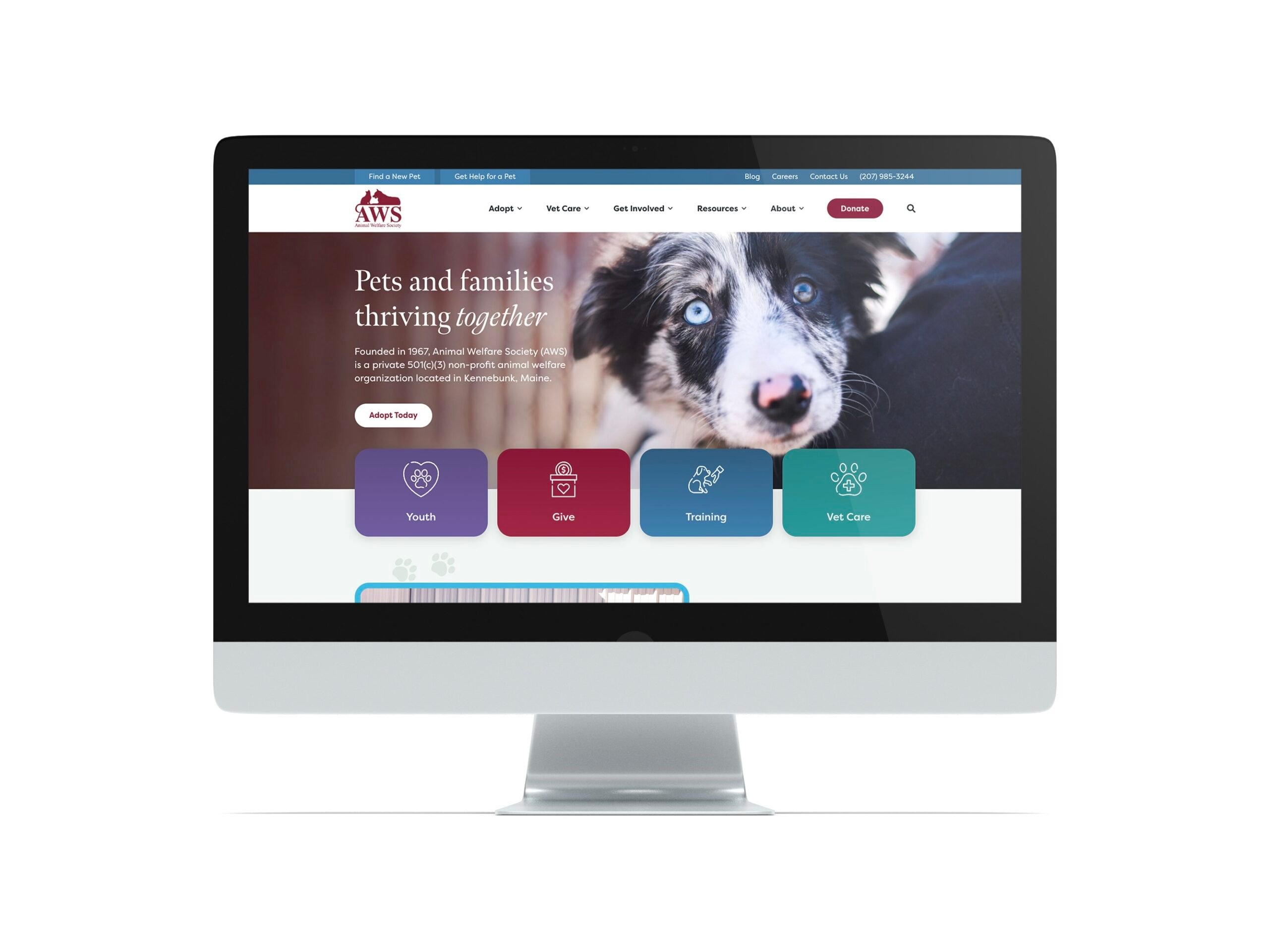
The website is more than just a search tool to find your next furry companion; it’s a platform to showcase the incredible work being done by the Animal Welfare Society. The organization provides shelter, veterinary care, training, and resources to more than 10,000 pets and community members annually.
Searching for a new dog, cat, or another furry/feathered friend? The adoption page pulls data directly from AWS’s adoption platform, Shelterluv. This means that a user gets real-time data updates on animals available for adoption AND the client can present the animals in the most loving way possible.
When we work with an API, we can present the data exactly how the client wants it—we’re not locked into a set format based on an iframe embed. This means all styles are on brand, the animal’s information is ordered in such a way as to make it easy for a user to get introduced to the animal and determine if it’s the right fit for them.
We can also control what information gets presented on the search page, both on the animal cards (what a user sees about the animal: name, age, breed) and the filters that a user can select to narrow down their results.
When an animal is adopted, data is updated in real-time, and the animal is removed from the search page so users only see which animals are available for adoption.
One of the primary goals for rebuilding the AWS website was to make information easier for a user to find as well as make information easier to manage and update from a site admin perspective. It’s best to have one “source of truth” for information—a place where the site admin can edit/manage content and then disperse it throughout the site. AWS Staff, Events, and Blog posts are all managed in one area of the site admin but can be dynamically pulled into a page based on an associated taxonomy. For example, on the Literacy & Story Hours page, we are pulling in events tagged by the event name so information gets dynamically pulled and displayed on the page but is managed within the Events section of the site.
AWS also offers a plethora of resources for newly adopted animals, from training classes to helpful articles to adoption stories. These resources must be easy to access and remain up-to-date. We reworked the sitemap to group Resources into its own section and presented the pages in a mega menu so a user can view the available content in each section of the site.
What better way to support AWS’s cause than through online donations? The client uses Blackbaud to collect donations and we are embedding a form directly onto the site for a user to donate online.
One of the biggest pet peeves of the old AWS site was the feeling that the content was too condensed and cluttered. We opened up the site both horizontally and vertically to allow a user to scroll through at their own pace and not feel visually overwhelmed by information. The color palette and font selection communicate a welcoming, friendly, and compassionate tone—a vibe that was very important for AWS to convey.
One of my favorite terms to use is the concept of “Purposeful Redundancy”. I am not sure if I coined it during a kickoff or if it’s a term that exists in the wild (probably does). But what it means in this context is making key pieces of information repeatable throughout the site. Everyone browses differently and may not always see something the first time. My favorite way to create a repeatable section of the site is to include a quick links bar above the footer. What are the key actions a user may want to take on your site? Identify them and repeat them where you think you may lose a user.
For AWS, we have a quick links bar above the footer as well as in the utility bar at the top of the site to ensure a user can quickly self-select their path on the site.
This website was a pure delight to work on, in every possible way. We are so thrilled with the end result and hope you are, too!
And, a huge thank you to the Animal Welfare Society for entrusting us with this project. We are honored to have played a role in bringing their vision to life.